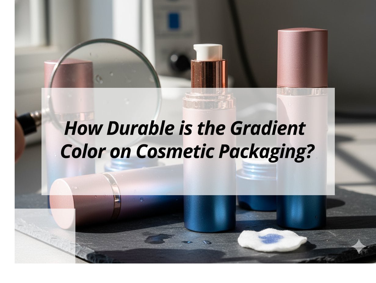
Have you ever wondered if the stunning gradient colors on your cosmetic packaging will last? You're not alone; durability is a common concern in maintaining brand aesthetics.
The durability of gradient color on packaging for cosmetics hinges on materials, printing techniques, and exposure to elements. Using high-quality inks and protective coatings can significantly extend the lifespan, ensuring your products remain visually appealing.
Understanding the factors affecting durability is crucial for maintaining a striking visual presence. Let's dive deeper.
What are the best colors for skincare packaging?
Choosing the right colors can elevate your brand and attract the right audience. But what are the best options for skincare?
The best colors for skincare packaging are often soft, natural tones like pastels or greens, which convey freshness and purity. These colors enhance the perception of health and wellness, appealing to a broad audience seeking holistic and gentle skincare solutions.
Exploring Skincare Packaging Colors
Color Psychology
- Pastels: Imply gentleness and care.
- Greens: Signify natural ingredients and eco-friendliness.
- Whites and Beiges: Simple elegance and cleanliness.
Selecting the right palette not only attracts the target demographic but also reinforces brand messaging.
Consumer Preferences
- Trendy Colors: Stay updated with seasonal trends and consumer preferences1.
- Cultural Significance: Understand local color meanings to avoid misinterpretations.
- Market Segment: Align colors with the market segment, such as premium or mass-market.
These insights guide your color choices, ensuring they resonate with consumers and reflect brand values.
What is the color gradient theory?
Gradient colors are captivating, but how do they work? Understanding the theory can elevate your designs.
Color gradient theory involves the gradual blending of colors, creating a seamless transition that adds depth and interest to packaging for cosmetics. By leveraging contrasting and complementary colors, brands can create dynamic visuals that catch the eye and remain memorable.
Understanding Gradient Theory
Basics of Gradients
- Linear vs. Radial: Linear gradients blend along a line; radial gradients revolve around a central point.
- Color Stops: Define transition points and determine gradient flow.
Gradients provide versatility, allowing for unique visual effects that can be tailored to brand needs.
Applications in Packaging
- Vibrant Effects: Use gradients to create vivid, eye-catching designs.
- Subtle Transitions: Employ softer gradients for an understated, classic look.
Implementing gradient theories effectively adds dimension and appeal to cosmetic packaging, making products stand out on crowded shelves.
What is the 60 30 10 rule with 4 colors?
Balancing colors can be challenging. This rule offers a structured approach to color harmony in design.
The 60 30 10 rule for four colors involves using 60% of a dominant color, 30% of a secondary color, and 10% each of two accent colors. This strategy ensures a well-balanced, visually appealing design without overwhelming the viewer.
Applying the 60 30 10 Rule
Proportionate Use
- Dominant Color: Sets the primary tone and atmosphere.
- Secondary Color: Complements the dominant, adding depth.
- Accent Colors: Provide contrast and highlight key elements.
| Proportion | Color Type | Application Example |
|---|---|---|
| 60% | Dominant | Packaging background |
| 30% | Secondary | Typography or borders |
| 10% (x2) | Accent | Logos or embellishments |
Properly employing this rule achieves visual harmony and enhances brand recognition.
Does the color of packaging matter?
Colors impact first impressions. Do they truly influence consumer decisions?
Packaging color significantly affects consumer perception and purchasing behavior by conveying messages about the product and brand values. Carefully chosen colors can evoke emotions and shape brand identity, ultimately influencing buying decisions on both conscious and subconscious levels.
Influence of Packaging Colors
Emotional Resonance
- Warm Colors: Energize and stimulate, perfect for dynamic brands.
- Cool Colors: Calm and soothe, ideal for luxury or wellness products.
Colors not only attract but can also convey promises and create expectations.
Branding Consistency
- Maintaining Cohesion: Align packaging colors with overall brand aesthetics for a unified message.
- Market Differentiation: Stand out by using distinctive color schemes that reflect brand values.
Selecting the right packaging colors plays a vital role in building customer loyalty by creating a memorable and trustworthy brand image.
My insights: Evaluating the Durability of Gradient Colors on Cosmetic Packaging
Concerned about the durability of gradient colors2 on your packaging? Discover how application methods3 and materials influence longevity.
Gradient colors on cosmetic packaging are highly durable when using UV printing and high-quality inks. Coated finishes and proper curing processes enhance their resistance to fading, scratching, and environmental factors.
Understanding Gradient Color Longevity in Cosmetic Packaging
1. Application Methods:
- Techniques: Spray coating and UV printing ensure strong adhesion and colorfastness. Protective finishes enhance durability.
- Surface Preparation: Essential for ensuring adhesion on various materials like glass and acrylic.
2. Material Considerations:
- Material Impact: Glass and metal offer superior durability over plastics, which may fade without proper protection.
- Special Treatments: Curved surfaces, such as those on airless pumps, require specialized coatings.
3. Environmental Factors:
| Factor | Impact | Mitigation |
|---|---|---|
| Sunlight Exposure | Can cause fading | Use UV protection and high-quality inks |
| Humidity and Handling | Accelerates wear and scratching | Utilize protective laminates and clear coats |
Testing for abrasion and chemical compatibility is crucial for predicting real-world performance. Implementing quality control and using advanced technology ensure that gradient finishes remain vibrant and resilient.
Conclusion
Understanding color durability and strategic application enhances brand appeal and ensures the longevity of packaging for cosmetics, ultimately strengthening market presence.
-
Stay updated on consumer preferences to ensure your packaging aligns with market trends and attracts buyers. ↩
-
Find out how to ensure your gradient colors remain vibrant and durable through proper techniques. ↩
-
Explore effective application methods to enhance the longevity and quality of your packaging designs. ↩