Colors are a fundamental part of branding strategy, particularly in skincare. Choosing the right hues can transform perceptions, brand recall, and consumer attraction, ultimately affecting the success of a product line.
The optimal colors for skincare packaging typically include soft pastels, earthy browns, and crisp whites. These choices create a sense of serenity, naturalness, and purity, establishing a brand’s credibility and allure.
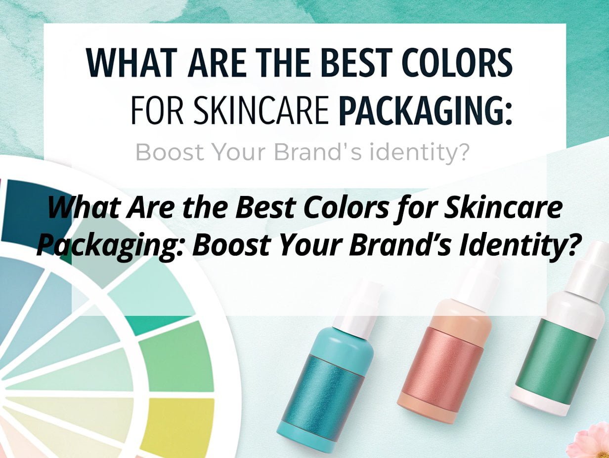
With an emphasis on harmonious design and consumer psychology, selecting the right colors is key. Let's explore how these choices can enhance your brand identity.
What is the most attractive color for packaging?
Colors generate emotions and influence consumer decisions significantly, so they must align with the brand ethos and target audience.
Colors like soft pastels, earthy tones, and bright whites are considered the most compelling for skincare packaging. These shades convey calm, authenticity, and clarity, resonating strongly with consumers.
Understanding why these colors captivate consumers can significantly benefit packaging design and brand identity. Here’s why they are effective and how they can be implemented in your strategy.
Attractive Colors
Soft pastels, earthy tones, and whites are versatile, representing different facets of skincare appeal:
-
Soft Pastels1: These gentle hues often evoke a sense of calm and are perfect for products aimed at providing relaxation and gentle care.
-
Earthy Tones2: These shades underscore natural ingredients, reinforcing an authentic and organic message.
-
Bright Whites3: Used to symbolize purity and cleanliness, whites are ideal for brands focused on a minimalist and sustainable approach.
Key Points on Soft Pastels
- Signal gentle care and calmness.
- Ideal for products focused on relaxation or sensitive skin care.
- Compatible with minimalist designs that emphasize elegance.
Insights on Earthy Tones
- Emphasize organic and natural beauty.
- Perfect for eco-conscious branding.
- Pair well with recycled packaging materials.
Significance of Bright Whites
- Implies purity and clinical efficacy.
- Suits clean-label and clinical skincare lines.
- Creates a stark, modern look with black accents.
Choosing these colors can significantly impact brand storytelling and consumer experience, reinforcing your unique selling proposition.
What color attracts customers more?
Color has the power to draw customers in, influencing their perceptions and emotions. It’s vital to select hues that convey your brand message clearly and attractively.
Blues and greens stand out as colors that attract customers, offering associations with trust, reliability, and eco-friendliness. These shades help in building brand credibility and consumer loyalty.

It’s essential to tap into the emotional connections that these colors inspire. Let’s explore how blue and green can enhance consumer interaction with your brand.
Color Attraction
Blues and greens hold emotional sway in consumer minds, attributing specific qualities to products:
| Color | Emotional Appeal | Brand Alignment |
|---|---|---|
| Blues | Reliability, tranquility | Clinical or solution-based products |
| Greens | Sustainability, health, freshness | Botanical-focused and wellness brands |
Using such colors ensures your brand is perceived as dependable, eco-friendly, and therapeutic, ultimately fostering consumer trust and repeated engagement.
What is the most attractive color for branding?
Brand color schemes are essential components of a brand's identity, affecting how customers perceive and connect with your products.
Black and gold4 are considered highly attractive for branding in the skincare industry. These colors convey luxury, sophistication, and exclusivity, appealing to a premium segment of the market.
Black and gold together create a strong, memorable visual identity that communicates value and luxury. Let’s delve into their combined impact.
Branding Colors
These colors provide a strong visual presence and convey significant emotional messages:
-
Black: Denotes elegance, power, and sophistication. It strengthens the brand's image as high-end and exclusive.
-
Gold: Suggests luxury and premium quality. It often serves as an accent that elevates the overall design.
Key Insights on Black
- Conveys sophistication and timelessness.
- Suitable for targeting an affluent demographic.
- Works well with metallic accents for a modern edge.
Insights into Gold
- Radiates luxury and opulence.
- Used as an accent, it elevates the entire brand presence.
- Paired with black, it emphasizes quality and exclusivity.
Adopting black and gold in your branding colors creates a distinct, refined, and aspirational brand image that appeals heavily to consumers seeking premium products.
What are the psychological colors for skincare?
Understanding the psychological impact of colors can enhance brand communication, helping predict consumer reactions and preferences.
Colors like white, green, and blue are potent psychological colors in skincare. They are linked with purity, eco-friendliness, and trust, aligning with trends in clean beauty and sustainability.
Delving into the psychological symbolism of these colors can inform more strategic and effective branding decisions.
Psychological Effects
These colors resonate emotionally with consumers, enhancing brand appeal:
| Color | Psychological Impact | Consumer Alignment |
|---|---|---|
| White | Purity, simplicity | Clinical and minimalist branding |
| Green | Eco-consciousness, health | Botanical, sustainable positioning |
| Blue | Trust, reliability | Hydrating and solution-based products |
Utilizing these psychological colors can elevate consumer perceptions, enhance brand differentiation, and promote lasting engagement.
My Insights: Best Colors for Skincare Packaging to Boost Your Brand’s Identity
Struggling to make your skincare brand stand out? Discover how color choices can enhance your brand's identity and attract your target audience.
Colors like white, blue, green, pink, and gold are pivotal in skincare packaging, each conveying distinct emotions and brand messages. Choosing the right colors helps reinforce brand values and appeal to consumer preferences.
Skincare Packaging Colors
Key Color Choices
- White: Symbolizes purity and simplicity, perfect for clean lines.
- Blue: Evokes calmness and trust, suitable for hydrating products.
- Green: Represents nature and sustainability, ideal for organic offerings.
- Pink: Suggests softness and care, great for gentle treatments.
- Gold: Implies luxury, used for premium products.
How Colors Shape Brand Identity
- Consistency: A uniform color palette enhances brand recognition.
- Target Audience: Match colors to demographics; pastels for youth, metallics for luxury.
- Emotional Impact: Colors convey messages: tranquility (blue), purity (white), freshness (green).
| Color | Emotion/Message | Best For |
|---|---|---|
| White | Purity, simplicity | Clean skincare lines |
| Blue | Calmness, trust | Hydrating and soothing products |
| Green | Nature, sustainability | Organic and eco-friendly products |
| Pink | Softness, care | Gentle skin treatments and creams |
| Gold | Luxury, prestige | High-end anti-aging products |
Strategic color choices, aligned with your brand and product promises, will help your skincare range connect with consumers and stand out in a competitive market.
Conclusion
Effective use of color in skincare packaging significantly enhances brand identity and consumer loyalty. Through thoughtful color selection, brands can align more closely with their values, engage consumers, and capture market prominence.
-
Explore how soft pastels can evoke calmness and enhance your skincare brand's appeal. ↩
-
Discover the impact of earthy tones on branding and their connection to natural ingredients. ↩
-
Learn how bright whites symbolize purity and can elevate your brand's image. ↩
-
Find out how black and gold convey sophistication and exclusivity in skincare. ↩