In today's competitive cosmetic market, brand aesthetics play a critical role in attracting consumers.
Aesthetic cosmetic jars often use popular colors like pastels and bold, vibrant hues to align with current beauty trends. These shades not only resonate with consumers but also help brands stand out by conveying their unique identity, enhancing both brand recognition and customer appeal.
Colors not only attract but also define a brand's identity, prompting deeper engagement.
What are the beauty industry colors?
The cosmetic industry loves experimenting with colors to capture the essence of their products.
Beauty industry colors include a spectrum of shades like soft pastels, metallics, and timeless classics1. These colors align with trends and convey messages tailored to specific consumer demographics, tapping into emotions and preferences.
The vibrant palette used in cosmetics, let's explore:
Hues and Their Meanings
- Pastels: Soft and inviting, often used for skincare and wellness lines.
- Metallics: Bold and luxurious, frequently seen in high-end makeup.
- Classics (Black, White): Timeless and versatile, suitable for any brand.
Industry Color Table
| Color Category | Description | Use Case |
|---|---|---|
| Pastels | Soft, calming hues | Skincare, wellness products |
| Metallics | Bold, premium appearance | Luxury makeup |
| Classics | Timeless, versatile shades | Universal brand applicability |
By understanding these color trends, brands can align their packaging with consumer expectations, ensuring visibility and appeal. Carefully selected colors resonate with target audiences, enhancing perceived value and fostering brand loyalty.
What are the colors for luxury packaging?
Luxury brands use colors to signify sophistication and exclusivity.
Colors for luxury packaging often include deep, rich tones like black, gold, and burgundy. These colors evoke a sense of opulence and prestige, appealing to affluent consumers who seek premium experiences.
Elements of Sophistication
- Black: Mystery and elegance.
- Gold: Wealth and opulence.
- Burgundy: Richness and depth.
These colors communicate exclusivity and allure, making them ideal for luxury cosmetic lines. By selecting the right hue, a brand can instantly elevate its image, appealing to discerning buyers who value aesthetics as much as the product itself.
Key Insights
- Black conveys elegance and sophistication, creating a premium brand image.
- Gold symbolizes wealth, enhancing high-value perception.
- Burgundy reflects richness, offering a unique and noble appeal.
These colors capture attention and communicate a brand's luxe positioning, enhancing both aesthetic appeal and perceived quality.
What makes a cosmetic color amazing?
The right color can transform a simple jar into a masterpiece, drawing attention and admiration.
Amazing cosmetic colors balance aesthetics and psychology, combining appealing visuals with emotional impact. They captivate consumers, making products memorable, thus effectively conveying brand stories and values.
Creating Impactful Colors
Key factors include:
- Contrast: Bold color combinations catch the eye.
- Harmony: Complementary colors create balance and appeal.
- Trend Relevance: Staying current ensures appeal to modern consumers.
Important Aspects
- Contrast increases visibility and recognition, attracting customers.
- Harmony offers a balanced look, fostering long-term brand loyalty.
- Trend relevance aligns with preferences, boosting market share.
By integrating these elements, brands can craft packaging that resonates on a deeper level, enhancing brand perception and customer retention.
What are the psychological colors for skincare?
Colors influence emotions and can shape consumer perceptions of effectiveness and care.
Psychological colors in skincare packaging often include calming blues, greens for freshness, and whites for purity. These hues instill trust and relaxation, important for products focused on health and wellness.
Psychological Insights
- Blue: Trust and serenity.
- Green: Natural and fresh.
- White: Purity and simplicity.
These colors suggest the gentle, effective nature of skincare products and foster an emotional connection that enhances customer satisfaction and loyalty.
Emotional Connection
| Color | Emotion | Consumer Influence |
|---|---|---|
| Blue | Calm, trustworthy | Encourages buying decisions |
| Green | Fresh, natural | Aligns with wellness trends |
| White | Pure, simple | Simplifies product messaging |
These colors not only contribute to an appealing design but also enhance the overall customer experience by aligning with psychological expectations of relaxation and care.
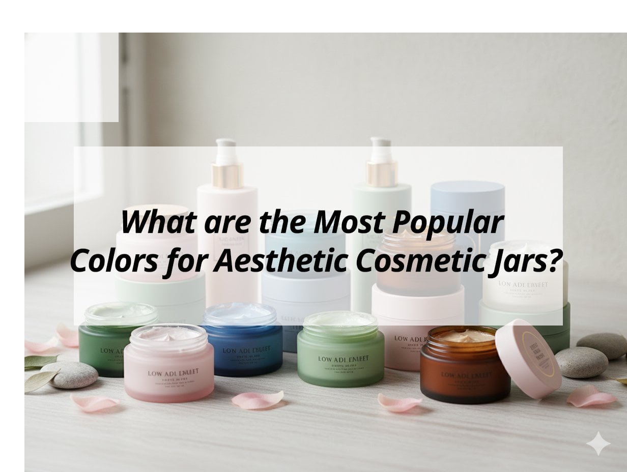
My insights: The Most Popular Colors for Aesthetic Cosmetic Jars
Struggling to choose the right colors for cosmetic jars? Discover the trending hues that capture elegance and eco-consciousness.
The most popular colors for aesthetic cosmetic jars include soft pastels2, earthy tones3, metallics like gold and silver, classic black and white, and vibrant shades4 for youthful appeal5. These choices convey luxury, purity, and environmental awareness.
Exploring Popular Cosmetic Jar Colors
Trending Color Themes:
-
Earthy and Natural Tones: Colors like mocha, soft gray, and beige are rising, reflecting eco-friendliness and a connection to nature. These hues align with brands focusing on natural or sustainable products.
-
Classic Black and White: Timeless and versatile, black conveys luxury and sophistication, while white suggests purity and simplicity, fitting minimalist aesthetics.
Luxurious and Vibrant Accents:
-
Metallic Shades: Gold, silver, and rose gold attract attention for premium products, adding a sense of luxury and modernity. They are ideal for limited-edition lines or high-end cosmetics.
-
Youthful and Playful Colors: Pinks and purples provide a feminine touch, while bold reds convey passion, appealing to younger audiences or specific product lines like lipsticks.
Color Applications and Impact Table:
| Color Theme | Qualities | Ideal Use Cases |
|---|---|---|
| Earthy/Natural | Eco-friendly, calming | Natural skincare, organic lines |
| Black/White | Sophistication, purity | Luxury products, minimalist designs |
| Metallics | Luxury, modernity | Premium, limited editions |
| Vibrant Shades | Youthful, energetic | Targeting young demographics, playful lines |
Choosing the right color enhances brand identity, helps target specific markets, and emphasizes qualities like sustainability, luxury, and nature, catering to diverse consumer preferences.
Conclusion
Selecting the right colors for cosmetic jars can significantly impact brand perception and consumer engagement. By aligning with industry trends and psychological preferences, brands can effectively capture attention and convey their message.
-
Learn about classic colors that never go out of style and their impact on branding. ↩
-
Explore how soft pastels can enhance the appeal of skincare and wellness products. ↩
-
Find out how earthy tones can enhance the appeal of natural and sustainable products. ↩
-
Find out how vibrant colors can energize branding and attract attention. ↩
-
Discover which colors resonate with younger consumers and boost product appeal. ↩