Selecting the ideal color for beauty products presents a significant challenge. An incorrect color choice can negatively impact product appeal. Many brands often select colors without a clear understanding of consumer psychology. This can lead to missed sales opportunities.
The most effective color for beauty products varies based on the specific product and its intended audience. Warm colors such as red and orange can draw attention and symbolize energy or passion. Cool colors like blue and green often convey serenity, freshness, or natural qualities. Neutral colors like white and black communicate sophistication and adaptability.
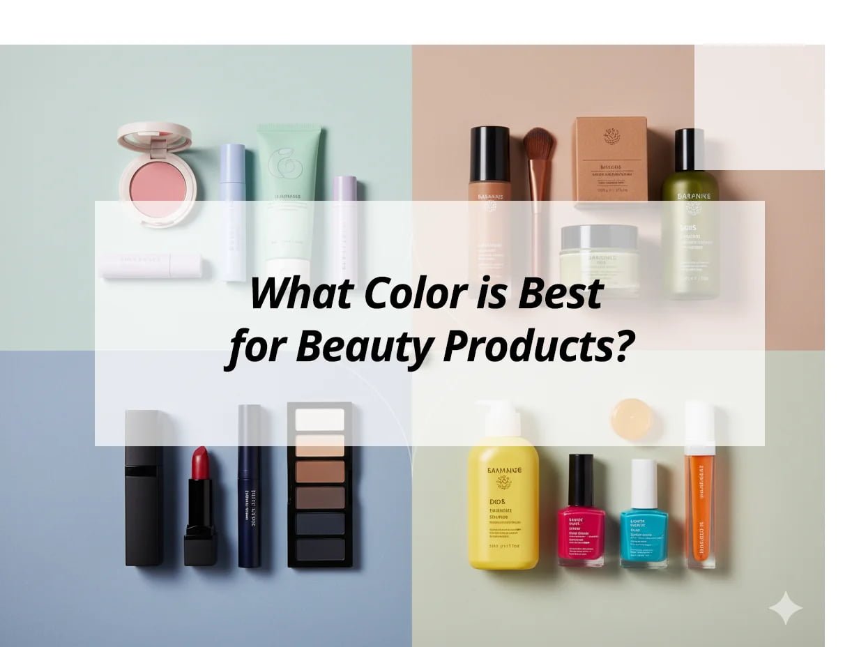
Color selection in beauty packaging is critical. It goes beyond mere aesthetics. Color acts as a visual communicator. It conveys brand identity and product benefits. Understanding color influence is key to enhancing product visibility and market success.
What is the best color for skincare products?
A common question in the beauty industry concerns the optimal colors for skincare products. Effective color choices are crucial for building consumer trust and brand perception in the skincare sector.
Optimal colors for skincare products1 typically include cool, natural, and subdued tones. Blues, greens, and whites effectively suggest purity, freshness, and calmness. Light pastels, earth tones, and transparent packaging are also highly effective. These colors create a perception of safety, cleanliness, and efficacy in skincare formulations.
The importance of color in skincare packaging is evident in market trends. Colors such as soft sky blue or gentle mint green can make a skincare product feel revitalizing. Pure white packaging often communicates luxury and hygiene. Such color choices signal to the consumer that the product is trustworthy and beneficial.
Why Do Natural Tones Work for Skincare?
Natural tones create a connection with nature. This association leads consumers to perceive products as containing pure and wholesome ingredients.
| Color | Feeling Conveyed | Skincare Benefit |
|---|---|---|
| Light Green | Freshness, Nature | Organic, soothing |
| Sky Blue | Calm, Purity | Hydrating, gentle |
| White | Clean, Simple | Minimalist, effective |
| Earth Tones | Natural, Grounded | Organic, nourishing |
These colors align with consumer desires for natural and high-quality skincare. For example, a brown glass bottle for an oil-based serum can suggest natural origins and rich ingredients. Transparent packaging for a gel product highlights its clean texture and formulation.
The Impact of Subtlety
Skincare often focuses on subtle improvements. Packaging design should reflect this nuanced approach. Overly bright or loud colors can be counterproductive.
- Soft Pastels: These suggest gentleness and delicate care.
- Matte Finishes: These convey a sense of understated luxury.
- Minimalist Designs: A clean aesthetic implies product integrity and efficacy.
High-end skincare products frequently adopt subtle packaging designs. A simple white jar for a cream with a delicate logo can communicate superior quality. This approach is particularly effective in markets where premium presentation is highly valued.
Tailoring Colors to Skincare Functions
Specific product functions can be reinforced through color choices.
- Anti-aging products: Gold or deep purple can symbolize luxury and advanced efficacy.
- Acne treatments: Light blue or green can suggest soothing and healing properties.
- Hydrating serums: Clear or light blue packaging can emphasize moisture and hydration.
For instance, a vacuum bottle in a soft lavender color can suggest calming properties for sensitive skin. A sleek black lotion bottle can provide a premium feel for an anti-aging product line.
What is the 60 30 10 rule with 4 colors?
The 60-30-10 rule is a widely recognized design principle. However, its application with four colors can be confusing. This rule helps achieve visual balance in color schemes.
The 60-30-10 rule dictates that a design should consist of 60% dominant color, 30% secondary color, and 10% accent color. When incorporating a fourth color, the ratios can be adjusted. For instance, a possible distribution could be 50% dominant, 25% secondary, 15% for a third color, and 10% for an accent. Alternatively, the traditional 60-30-10 rule can apply to the primary three colors, with the fourth serving as an additional, smaller accent.
Brands frequently utilize this rule for cosmetic packaging, including lipstick tubes, lip gloss tubes, and eyeshadow cases, to achieve a professional appearance. Incorporating a fourth color often involves subdividing one of the smaller percentages. For example, the 30% secondary color could be split into two colors at 15% each, adding visual complexity while maintaining balance.
Applying the 60-30-10 Rule with Four Colors
Each color's role in the design must be carefully considered to ensure effective application.
- Dominant Color (approx. 50-60%): This is the primary color, setting the overall mood and covering the largest areas.
- Secondary Color (approx. 20-25%): This supports the dominant color, providing contrast and visual interest.
- Third Color (approx. 10-15%): This adds an additional layer, contributing to design complexity.
- Accent Color (approx. 5-10%): This provides a small focal point, drawing the eye to specific details.
| Role | Percentage Example | Purpose |
|---|---|---|
| Main | 55% | Establishes overall tone, covers large areas |
| Supporting | 25% | Offers contrast, complements main color |
| Complementary | 10% | Adds complexity, subtle visual interest |
| Highlight | 10% | Draws attention, emphasizes small details |
Consider a lipstick tube design: 60% black (dominant), 30% gold (secondary), and 10% red (accent for the logo). If a fourth color, such as a subtle metallic shimmer, is added, it might occupy 5% of the design, reducing the gold or red percentage. This enhances luxury without overwhelming the primary design elements.
Achieving Visual Harmony
The goal is harmonious balance. No single color should dominate excessively, apart from the designated accent.
- Primary Brand Color: This typically forms the 60% dominant color.
- Complementary Secondary Color: This color should harmonize with the dominant color.
- Depth-Adding Third Color: This can be a variant shade to add visual richness.
- Striking Accent Color: This color should stand out, adding dynamic energy.
For instance, an eyeliner tube designed for a sleek aesthetic might feature 60% matte black, 30% silver banding, and 10% bright blue detailing. If a fourth color is desired, a subtle holographic element could be integrated into the silver band, making the silver 25% and the holographic detail 5%. This creates a modern and appealing product.
Significance for Packaging Design
The 60-30-10 rule ensures a professional and cohesive packaging appearance.
- Professionalism: Balanced color schemes appear thoughtfully designed.
- Brand Cohesion: Consistent color application reinforces brand identity.
- Consumer Appeal: Harmonious color combinations are visually pleasing.
Well-balanced colors in an air cushion case, for example, communicate attention to detail, suggesting a high-quality product within. This structured approach to color design contributes significantly to market perception.
What are the colors associated with beauty?
The question of which colors inherently represent beauty is often considered. Certain colors consistently evoke concepts related to self-care, allure, and aesthetic appeal within the beauty industry.
Colors commonly associated with beauty include various shades of pink, purple, gold, silver, and the classic combination of black and white. Pinks frequently symbolize femininity, softness, and youthfulness. Purples can convey luxury, creativity, and elegance. Gold and silver signify glamour, prestige, and superior quality. Black offers sophistication and timeless elegance, while white represents purity and simplicity.
Observations across numerous beauty product lines support these associations. For example, a rose gold lipstick tube can effectively communicate modern luxury and a feminine touch. An eyeshadow case in deep violet can suggest creativity and a bold aesthetic. These color choices are deliberate, carrying meanings that resonate with consumers seeking beauty products.
The Psychological Impact of Beauty Colors
Each color conveys a distinct message. This influences consumer perception and emotional connection with a product.
- Pinks: Ranging from soft pastels to vibrant fuchsias, these colors suggest romance, gentleness, and charm. They are frequently used for lip gloss tubes and blush compacts.
- Purples: From light lavender to deep plum, these colors communicate mystery, wisdom, and luxury. They are often chosen for premium cosmetic packaging, such as cream jars.
- Golds and Silvers: These metallic shades exude glamour, wealth, and high quality. They are frequently used as accent colors or for entire packaging components to signify opulence.
- Black: A timeless color, black conveys sophistication, power, and elegance. It is commonly used for mascara and eyeliner tubes.
- White: Symbolizing purity, freshness, and simplicity, white is prevalent in skincare and minimalist beauty brands.
| Color | Common Associations | Beauty Product Examples |
|---|---|---|
| Pink | Femininity, Softness | Lip gloss, blush |
| Purple | Luxury, Creativity | High-end creams, eyeshadow |
| Gold | Glamour, Prestige | Luxury lipstick, serum bottles |
| Silver | Modernity, Elegance | Eyeliner, compacts |
| Black | Sophistication, Power | Mascara, sleek foundation |
| White | Purity, Simplicity | Skincare, clean beauty |
Gold and silver accents are particularly effective for consumers who prioritize quality. A vacuum bottle with a gold pump, for example, immediately elevates the product's perceived value. It signals a premium item.
Expanding Beyond Core Beauty Colors
While certain colors are classic, others also play significant roles in beauty branding.
- Reds: Bold and attention-grabbing, reds signify passion, energy, and confidence. This is exemplified by classic red lipstick.
- Blues: These can be calming or vibrant, suggesting freshness, trust, or innovation. They are well-suited for skincare products.
- Greens: Connecting with nature, greens convey health, organic qualities, and freshness. They are effective for natural beauty product lines.
For example, a vibrant teal for an eyelash tube can combine the freshness of blue with the natural feel of green. This dual appeal can make a product feel both modern and accessible, resonating strongly with target demographics.
Cultural Variations in Beauty Color Perception
The perception of beauty colors can vary across cultures. It is crucial to understand market-specific preferences.
- Southeast Asia: Often favors bright colors, pastels, and intricate designs.
- Middle East: Appreciates gold, rich jewel tones, and luxurious finishes.
- South America: Can be drawn to vibrant, warm colors and playful designs.
Considering these cultural nuances in packaging design ensures broader market appeal. A lotion bottle successful in one region might require different color schemes for another market.
What color attracts the most sales?
The question of which color drives the highest sales is frequently posed. There is no single, universally effective color. Sales attraction largely depends on product type, brand identity, and target demographic within the beauty sector.
The color most effective in attracting sales is context-dependent. However, colors such as red, pink, black, and gold are frequently successful in the beauty industry. Red can create urgency and excitement, pink often appeals to feminine markets, black conveys luxury, and gold implies premium quality. These colors help products stand out and communicate inherent value.
For instance, a vibrant red lipstick tube immediately captures attention, signaling confidence and boldness. Such packaging can prompt a consumer to notice and consider a product, even if they were casually browsing.
Why Specific Colors Enhance Sales
Certain colors evoke emotions that can directly influence purchasing decisions.
- Red: This powerful color quickly attracts attention. It generates a sense of urgency or passion. It is highly effective for limited editions or products aiming for a bold statement.
- Pink: Extremely popular in beauty, pink suggests femininity, sweetness, and youth. It is often used for products targeting younger demographics or those seeking a soft aesthetic.
- Black: A classic for luxury branding, black makes products appear sophisticated and high-end. Many premium cosmetic brands utilize black for their primary packaging.
- Gold: Symbolizing wealth and prestige, gold indicates a high-quality, exclusive product. It is often employed for anti-aging lines or luxury items.
| Color | Sales Impact | Common Use in Beauty |
|---|---|---|
| Red | Creates urgency, draws attention | Bold lipsticks, limited editions |
| Pink | Appeals to feminine, gentle markets | Blushes, lip glosses, youthful brands |
| Black | Conveys luxury, sophistication | Mascara, high-end foundations |
| Gold | Signals premium quality, glamour | Anti-aging, luxury serums |
| Blue | Builds trust, calm, freshness | Skincare, natural products |
For example, a cream jar with prominent gold accents often performs well in markets that value luxury and efficacy. In contrast, vibrant pinks and playful colors frequently attract younger demographics in other regions.
Understanding the Target Consumer
The most successful color is one that resonates deeply with the intended customer.
- Consumer Demographics: Consider the age, preferences, and values of the target audience.
- Desired Product Values: Identify whether the consumer prioritizes trust, luxury, or sensory experience.
- Color Alignment: Select colors that align with these identified values.
When designing custom packaging, these factors are crucial. For an eyeliner tube, a sleek black tube with silver lettering might be most appealing to a professional demographic. For a youthful market, a bright, sparkly pink might be more effective. Alignment between color and consumer profile is key.
Beyond Color: The Influence of Finish and Texture
The effectiveness of a color is also influenced by its presentation.
- Finish: Matte versus glossy. A matte black air cushion case can project a modern feel. A glossy red lipstick tube often evokes a classic aesthetic.
- Texture: Smooth versus textured surfaces. A textured surface can add tactile appeal and a sense of luxury.
- Combinations: How colors interact. A combination of black and gold typically sells better than a monochromatic black design for luxury items.
The ability to produce diverse finishes and textures allows for extensive experimentation in finding optimal product presentation. Small variations, such as the specific shade of pink or the tone of gold, can significantly influence sales performance.
My Insights: Choosing the Best Colors for Beauty Products
Struggling to find the perfect color for your beauty products? Learn how strategic color choices enhance brand identity and consumer appeal.
There is no single "best" color for beauty products; optimal choices depend on product category, target audience, and brand message. Colors like pink, black, and green evoke femininity, luxury, and eco-friendliness, influencing consumer perception.
Exploring Strategic Color Choices for Beauty Products
Color Psychology and Product Categories:
- Skincare: Soft neutrals and pastels communicate purity and gentleness.
- Makeup: Bold, saturated hues suggest creativity and self-expression.
- Luxury and Fragrance: Deep blacks with metallics signify sophistication and exclusivity.
Strategic Use of Color:
- White: Indicates cleanliness and safety, dominant in skincare.
- Green & Blue: Suggest nature, health, and eco-friendly attributes.
- Pink & Purple: Convey femininity and glamour.
- Red: Signals passion and energy, ideal as an accent.
- Black & Metallics: Associated with luxury and sophistication.
Aligning with Audience and Trends:
| Factor | Impact |
|---|---|
| Audience | Younger consumers prefer bold, high-energy palettes |
| Trends | Soft pinks and “Gen Z greens” leading in packaging |
The best color choice enhances brand positioning, reflects product benefits, and resonates with consumers. By understanding color psychology and market trends, beauty brands can make impactful decisions that strengthen their market appeal.
Conclusion
Color choice in beauty products is fundamental. It shapes brand perception and consumer engagement. Effective color selection establishes emotional connections. It enhances product differentiation. Understanding the target market is essential. This informs color decisions that drive sales success.
-
Discover how color choices can enhance consumer trust and brand perception in skincare. ↩