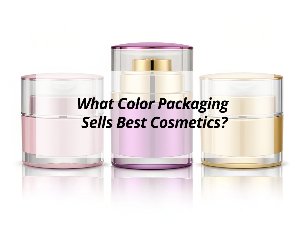
Walking through cosmetic stores worldwide, I notice patterns emerge—certain colors consistently dominate premium beauty sections. Color isn't just decorative; it's a silent communicator that speaks directly to consumer psychology. The right color can convey luxury, purity, innovation, or naturalness. Choosing the perfect packaging color requires understanding your brand identity, target audience, and market positioning. Color influences purchasing decisions more than most brands realize, affecting perceived quality, brand personality, and shelf impact.

Cosmetic packaging colors that sell best typically include elegant neutrals (white, black, gold), natural tones (earth tones, soft greens), and sophisticated blues/purples, with variations based on product category, brand positioning, and target demographic. White conveys purity for skincare, black signals luxury for makeup, soft pinks attract romance-seeking buyers, and earth tones appeal to natural/organic consumers, while metallic accents elevate premium perception across all categories.

Understanding color psychology helps brands select packaging that resonates emotionally and drives sales.

What is the most attractive color for packaging?

Attraction depends on context and target audience.

The most attractive packaging color1 varies by product category and demographic, but clean white often attracts attention for its association with purity and simplicity, while sophisticated black conveys luxury and premium quality. Metallics like gold and silver attract through associations with wealth and innovation, and category-appropriate colors like soft blue for hydration products2 or green for natural items attract through immediate relevance and psychological signaling.

Color Attraction Factors

Visual Appeal Elements:

  • Psychological associations and symbolism
  • Contrast and visibility on shelves
  • Cultural and demographic preferences
  • Category appropriateness and expectations

Highly Attractive Colors:

Color Attraction Reason Best For
White Purity, Cleanliness, Simplicity Skincare, Medical, Minimalist brands
Black Luxury, Sophistication, Elegance Premium makeup, Luxury products
Gold Wealth, Premium quality, Success High-end products, Special editions
Soft Blue Trust, Calm, Hydration Skincare, Wellness products
Earth Green Natural, Organic, Fresh Natural cosmetics, Eco brands

Selection Guidelines:

  1. Consider shelf context and competitor colors
  2. Understand target demographic color preferences
  3. Balance trendiness with timeless appeal
  4. Ensure color works across different materials and finishes
  5. Test actual packaging under store lighting conditions

What is the best packaging for skincare products?

Skincare packaging balances functionality with aesthetic appeal.

The best skincare packaging combines protective functionality, hygienic design, user-friendly application, and aesthetic appeal that communicates purity and efficacy. Airless pumps preserve ingredient integrity, opaque containers protect light-sensitive actives, minimalist designs convey clinical effectiveness, and luxurious materials justify premium positioning while maintaining practical considerations like easy dispensing, storage efficiency, and travel suitability.

Skincare Packaging Essentials

Functional Requirements:

  • Product protection and preservation
  • User experience and convenience
  • Brand communication and perception
  • Practical considerations and usability

Ideal Packaging Features:

Feature Importance Benefit
Airless technology High Preserves ingredients, Prevents contamination
UV protection3 Medium Protects light-sensitive ingredients
Hygienic dispensers High Maintains product purity, Reduces waste
Ergonomic design Medium Improves user experience, Enhances satisfaction
Minimalist aesthetic Variable Communicates efficacy, Professional appearance

Design Considerations:

  1. Prioritize functionality that protects product integrity
  2. Choose materials compatible with formula ingredients
  3. Ensure packaging communicates brand positioning effectively
  4. Consider user experience throughout product lifecycle
  5. Balance premium appearance with practical functionality

What are the best colors for beauty business?

Color selection aligns with brand positioning and product benefits.

The best colors for beauty business typically include clean whites for purity4, sophisticated blacks for luxury5, soft pinks for femininity, natural greens for organic positioning6, calming blues for trustworthiness, and metallic accents for premium quality. The optimal color palette depends on brand personality, target audience demographics, product category characteristics, and desired market positioning while maintaining consistency across product lines.

Beauty Industry Color Strategies

Strategic Considerations:

  • Brand identity alignment
  • Target audience preferences
  • Market positioning goals
  • Psychological impact optimization

Effective Color Applications:

Color Business Application Psychological Impact
White Skincare, Clinical lines Purity, Cleanliness, Effectiveness
Black Luxury makeup, Premium products Sophistication, Elegance, Exclusivity
Soft Pink Romantic products, Youth brands Femininity, Gentleness, Playfulness
Natural Green Organic, Eco-friendly lines Natural, Fresh, Sustainable
Deep Blue Professional, Scientific products Trust, Reliability, Innovation

Implementation Approach:

  1. Develop cohesive color strategy across all touchpoints
  2. Consider cultural color associations7 in target markets
  3. Use color to differentiate product lines or categories
  4. Ensure color works across various materials and formats
  5. Test color perception with actual target consumers

What color is associated with cosmetics?

Cosmetics traditionally use specific color associations.

Cosmetics are traditionally associated with luxurious black, elegant gold, feminine pink, pure white, and romantic red, though modern associations include natural greens for organic products, minimalist neutrals for clinical appeal, and vibrant brights for innovative brands. The specific color associations vary by product category, with makeup favoring dramatic tones and skincare preferring clean, clinical palettes that communicate specific benefits and brand positioning.

Color Association Patterns

Traditional Connections:

  • Historical industry conventions
  • Category-specific expectations
  • Cultural beauty standards
  • Evolving market trends

Category Associations:

Product Type Traditional Colors Modern Variations
Luxury Makeup Black, Gold, Deep Red Navy, Emerald, Jewel tones
Skincare White, Light Blue, Silver Earth tones, Pastels, Minimalist
Natural Products Green, Brown, Cream Muted tones, Organic palette
Mass Market Pink, Purple, Brights Saturated colors, Trend shades
Professional Clinical White, Metal Dark tones, Professional hues

Association Principles:

  1. Understand category color conventions before breaking rules
  2. Consider cultural color meanings in target markets
  3. Use color to signal product benefits or ingredients
  4. Maintain some industry alignment for immediate recognition
  5. Balance tradition with innovation for market relevance

What is the luxury color palette for packaging?

Luxury packaging uses specific color combinations.

The luxury color palette8 for packaging typically features deep blacks, rich golds, elegant silvers, sophisticated navies, and creamy ivories, often combined with metallic accents, matte finishes, and high-contrast combinations. Luxury packaging avoids bright, trendy colors in favor of timeless, sophisticated hues that convey exclusivity, quality, and refinement through subtle elegance rather than loud statements, with careful attention to finish quality and material feel.

Luxury Color Characteristics

Premium Quality Indicators:

  • Sophisticated color selection
  • High-quality material execution
  • Subtle rather than loud statements
  • Timeless appeal over trendiness

Luxury Color Combinations:

Primary Color Accent Colors Luxury Effect
Deep Black Gold, Silver Classic elegance, Premium quality
Navy Blue Gold, White Sophistication, Professional luxury
Burgundy Gold, Cream Rich tradition, Opulent feel
Charcoal Gray Silver, White Modern luxury, Understated elegance
Ivory/Cream Gold, Brown Timeless luxury, Organic premium

Luxury Execution:

  1. Focus on color depth and richness rather than brightness
  2. Use metallic accents sparingly for maximum impact
  3. Ensure colors work with premium materials and finishes
  4. Maintain consistency across entire product line
  5. Test packaging under various lighting conditions

What are the timeless colors for brands?

Timeless colors transcend trends and remain effective.

Timeless colors for brands include classic black, pure white, natural navy, sophisticated gray, and warm ivory—neutral, versatile shades that maintain appeal across decades rather than following fleeting trends. These colors provide stable brand foundations that allow for seasonal accent colors while maintaining recognizability, conveying reliability and longevity that resonates with consumers seeking established, trustworthy brands rather than temporary fashion statements.

Enduring Color Selection

Longevity Factors:

  • Cross-cultural acceptability
  • Trend resistance
  • Versatile application
  • Age demographic appeal

Timeless Color Applications:

Color Timeless Quality Brand Examples
Black Eternal sophistication, Luxury Chanel, Dior, Luxury automakers
White Perennial purity, Cleanliness Apple, Medical brands, Minimalists
Navy Blue Classic trustworthiness, Professionalism IBM, Banks, Corporate brands
Gray Enduring neutrality, Modern elegance Technology, Automotive, Premium products
Ivory/Cream Timeless warmth, Organic quality Natural brands, Luxury goods, Heritage products

Timeless Strategy:

  1. Build brand foundation on neutral, versatile colors
  2. Use accent colors for seasonal or product variations
  3. Avoid extremely trendy colors for core branding
  4. Ensure colors work across all media and materials
  5. Consider color longevity when establishing brand identity

How Color Consistency Builds Brand Recognition?

Consistent color use strengthens brand identity.

Color consistency builds brand recognition by creating visual continuity across touchpoints, reinforcing brand identity through repeated exposure, establishing industry position through color associations, and facilitating instant consumer recognition. Consistent color application across packaging, marketing materials, digital presence, and retail environments creates cohesive brand experiences that consumers remember and trust, ultimately driving loyalty and preference through visual reliability and professional presentation.

Consistency Benefits

Recognition Advantages:

  • Instant visual identification
  • Enhanced brand recall
  • Professional appearance
  • Trust building through consistency

Consistency Implementation:

Aspect Consistency Requirement Recognition Impact
Primary color Strict adherence across all materials Immediate brand identification
Secondary palette Controlled variation within guidelines Brand family recognition
Application rules Consistent placement and usage Professional, deliberate appearance
Color quality Maintained color standards across productions Quality perception, Brand integrity
Cross-platform Adaptation while maintaining essence Cohesive brand experience

Consistency Practices:

  1. Establish official color standards with Pantone references
  2. Create comprehensive brand guidelines for color usage
  3. Regularly audit color application across all touchpoints
  4. Train all partners on color requirements and importance
  5. Use color management systems for production consistency

Conclusion

The best cosmetic packaging colors balance psychological impact, market positioning, and timeless appeal while resonating with specific target audiences. Understanding color psychology helps brands choose packaging that not only attracts attention but also communicates the right brand values and product benefits.


  1. Explore insights on how packaging color influences consumer behavior and product appeal. 

  2. Find out why soft blue is a popular choice for hydration products and its psychological effects. 

  3. Learn about the importance of UV protection in maintaining product efficacy. 

  4. Explore the role of clean whites in establishing brand identity and consumer trust. 

  5. Learn how sophisticated blacks enhance the perception of luxury and exclusivity. 

  6. Discover how natural greens enhance the appeal of eco-friendly brands. 

  7. Explore how cultural perceptions of color can affect marketing strategies. 

  8. Learn about the color combinations that convey luxury and sophistication.