Are you facing challenges in selecting colors for skincare products? Appropriate color choices attract consumers and convey brand values. Color significantly influences how products are perceived by the market.
The optimal color for skincare products depends on brand identity, target demographics, and product category. Light, natural tones often suggest purity and gentleness. Brighter colors can communicate vitality or specific functional benefits. Darker shades may imply luxury or a scientific foundation.
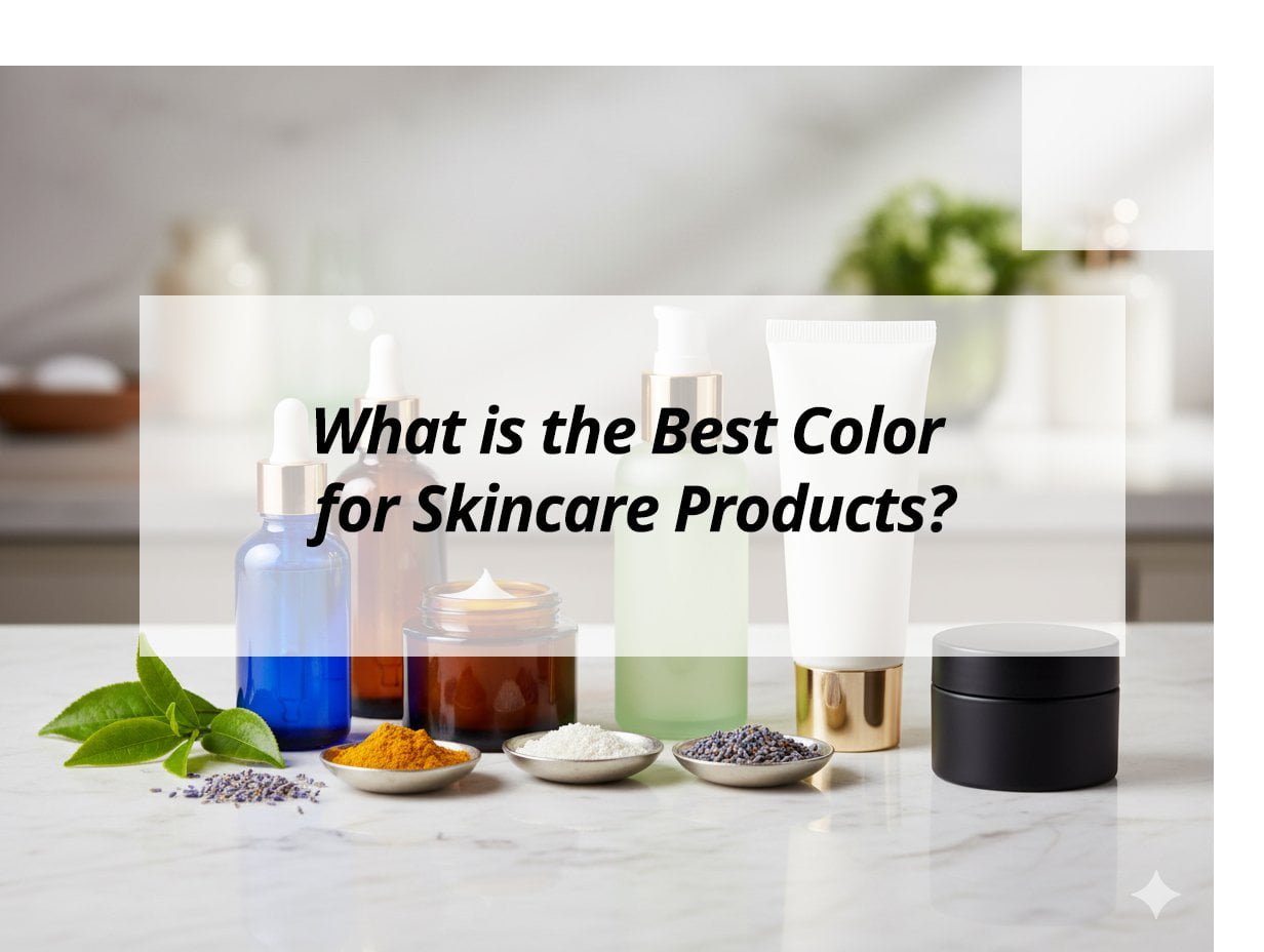
This article will explore how color affects skincare packaging. This information aims to assist in selecting colors that resonate with target consumers.
What is the best color for skincare?
Is there uncertainty regarding the most effective color for skincare packaging? Color serves as a powerful visual communication tool. It can capture attention and establish expectations for a product.
The best color for skincare products is one that aligns with the brand's message. It also needs to appeal to the target consumer group. Soft, natural colors, such as white, pastels, and earthy tones, are often effective. They imply purity, natural ingredients, and gentle care.
Brands frequently use color to convey their identity. For instance, an organic-focused brand might use green or brown. A luxury brand might prefer black, gold, or silver. A brand for sensitive skin might opt for white or light blue. The chosen color communicates the product's essence before any text is read.
Understanding Color Psychology in Skincare
Colors influence consumer perceptions.
- White: Commonly represents purity, cleanliness, and simplicity. It is a frequent choice for clinical or minimalist skincare brands.
- Blue: Conveys calmness, trustworthiness, and freshness. Light blues can suggest hydration or cooling sensations.
- Green: Associated with nature, organic components, and health. It is suitable for natural or environmentally conscious skincare lines.
- Pink: Suggests softness, femininity, and youthfulness. It is often used for hydrating or anti-aging products targeting female demographics.
- Black: Implies luxury, sophistication, and authority. It is frequently applied to high-end or men's skincare products.
- Gold/Silver: Represents premium quality, elegance, and high value. These metallic colors are often used as accents on luxury packaging.
Choosing Colors Based on Product Type
Different skincare product categories benefit from distinct color palettes.
| Product Type | Suggested Colors | Rationale for Color Choice |
|---|---|---|
| Hydrating Serums | Light Blue, Aqua, White, Silver | Suggests water, freshness, and light texture |
| Natural/Organic Creams | Green, Earth Tones (Brown, Beige), White | Represents nature, purity, and eco-friendliness |
| Anti-Aging Products | Gold, Silver, Deep Purple, Black, Dark Red | Conveys luxury, efficacy, and richness |
| Acne Treatments | White, Light Green, Pale Blue | Implies cleanliness, calm, and medicinal properties |
| Sensitive Skin Lines | White, Pale Pink, Light Blue | Suggests gentleness, purity, and non-irritating formulation |
When selecting colors, consider the product's primary function. For example, a sunscreen might use bright colors to convey protection and outdoor activity. A night repair cream might use darker, calming colors. The color should clearly indicate the product's purpose to the consumer.
What is the 80 20 color rule?
Are you familiar with the 80/20 color rule in design? This principle can help create visually balanced skincare packaging. It contributes to an aesthetically pleasing color scheme.
The 80/20 color rule dictates that 80% of a design employs a dominant color. The remaining 20% uses accent colors. This approach fosters harmony and focus within the design. It prevents visual clutter and helps highlight key elements.
This rule is frequently applied in cosmetic packaging design. For instance, an 80% white bottle with a 20% gold cap and logo projects elegance. It emphasizes premium details without saturating the primary color. This principle significantly impacts visual effectiveness.
Applying the 80/20 Rule to Skincare Packaging
This rule assists in achieving visual equilibrium.
- Dominant Color (80%): This is the primary color of the packaging. It typically covers the majority of the bottle or jar surface. It establishes the overall mood and background of the product. This color should align with the core brand message.
- Accent Colors (20%): These are secondary colors. They are used for elements such as logos, text, closures, or minor graphic details. Accent colors should provide a subtle contrast with the dominant color. This allows them to stand out and draw attention to important information or premium features.
The 80/20 rule ensures that one color maintains visual prominence. This provides a strong foundation for the design. The smaller applications of accent colors then add visual interest and emphasize key brand components. The objective is to establish visual hierarchy.
Benefits of the 80/20 Color Rule
Utilizing this rule offers several advantages.
- Visual Harmony: It creates a balanced and attractive appearance. This enhances the product's appeal on retail shelves.
- Brand Recognition: A consistent dominant color reinforces brand identity. It makes products easily identifiable.
- Highlights Key Features: Accent colors can draw attention to brand names, product benefits, or unique ingredients.
- Prevents Overwhelm: An excessive number of colors can lead to a chaotic packaging appearance. The 80/20 rule simplifies the design.
- Professional Appearance: It lends a polished and considered look to packaging. This often suggests higher product quality.
For a brand with multiple skincare products, maintaining a consistent 80% dominant color (e.g., white or a specific pastel) across the range unifies the collection. Subsequently, different 20% accent colors can differentiate between product types (e.g., blue for hydration, green for natural). This creates a cohesive yet distinct product line.
What is Gen Z's favorite color?
Is your skincare brand targeting Gen Z consumers? Understanding their color preferences is crucial. This demographic exhibits distinct tastes that influence their purchasing decisions.
Gen Z's most favored color is often reported as a shade of blue. However, their preferences are nuanced. They encompass a broad spectrum of vibrant, expressive, and authentic colors. This generation values colors that reflect individuality and align with current trends. These trends can range from muted pastels to bold, saturated hues.
Gen Z often seeks packaging that is aesthetically pleasing and suitable for sharing on social media platforms. Colors that perform well visually online or convey a specific mood are important considerations. This includes both established favorites and emergent shades.
Gen Z's Color Preferences and Skincare
Gen Z prioritizes authenticity and visual appeal.
- Blues: Various shades of blue consistently rank high in popularity. This may be attributed to associations with calmness, nature, and digital interfaces. In skincare, blues can suggest freshness and hydration.
- Vibrant & Bold Colors: Gen Z demonstrates an openness to bright colors, such as electric yellows, neon greens, or deep purples. These colors make products distinctive and convey a sense of playfulness and individuality.
- Muted Pastels: Alongside bold colors, soft, muted pastels like lilac, sage green, and dusty rose also show popularity. These colors offer a subtle yet sophisticated aesthetic. They align with minimalist design trends.
- Earthy Tones: Brands emphasizing sustainability and natural ingredients often use earthy tones. Gen Z's increasing concern for environmental impact makes these colors appealing.
- Gender-Neutral Colors: There is a growing preference for colors not traditionally linked to specific genders. This broadens appeal across diverse consumer segments.
Gen Z's preferences are dynamic. They frequently adopt colors that reflect current social and digital trends. Skincare brands targeting this demographic should consider dynamic and expressive color palettes.
How to Appeal to Gen Z with Color
Consider these factors for appealing to Gen Z.
- Social Media Appeal: Select colors that photograph well. Colors that stand out on platforms like Instagram or TikTok are important.
- Authenticity: Gen Z values transparency. Colors that appear genuine and less artificial tend to resonate more effectively.
- Sustainability Connection: Utilize colors that suggest natural ingredients or environmentally friendly packaging. This aligns with their values.
- Bold Accents: Even if the dominant color is subtle, bold accent colors can capture attention. This adds a distinctive element.
- Minimalist Trends: Simple, clean designs with thoughtfully selected colors can also be appealing. This reflects a preference for uncluttered aesthetics.
To engage with Gen Z, skincare packaging should be visually engaging. It should also convey authenticity. It needs to reflect their diverse interests. This means being receptive to both classic and trending color options.
What is the 3 color rule combination?
Are you seeking to develop a cohesive color scheme for skincare products? The 3-color rule provides a straightforward framework. It assists in designing packaging that appears professional and attractive.
The 3-color rule proposes using three primary colors in a design. This includes a dominant color (60%), a secondary color (30%), and an accent color (10%). This distribution ensures visual interest without overwhelming the observer. It establishes a harmonious and intentional aesthetic.
This rule is a common design principle. For example, a package might predominantly feature white (60%). It could incorporate a light blue secondary color (30%) for some text elements. A silver accent (10%) might then be used for a logo. This creates a clean and sophisticated appearance.
Applying the 3-Color Rule in Skincare
This rule offers a balanced approach to color application.
- Dominant Color (60%): This color occupies the largest area. It is typically the main color of the product bottle or outer carton. It sets the overall mood and serves as the background for the design. Choose a color that strongly represents the brand's core message.
- Secondary Color (30%): This color complements the dominant color. It is used for larger text blocks, secondary graphic elements, or less prominent parts of the packaging than the main body. It adds depth and works in conjunction with the dominant shade.
- Accent Color (10%): This is a small but impactful color. It is reserved for highlights, logos, small icons, or key calls to action. The accent color should provide a strong contrast with the other two colors. This ensures it stands out and draws attention to crucial details.
The 60-30-10 rule helps ensure that no single color dominates excessively. Each color fulfills a specific function. This creates a visually organized and attractive design.
Benefits of Using the 3-Color Rule
This rule offers clear advantages for packaging design.
- Clear Visual Hierarchy: It guides the viewer's eye. This facilitates easy comprehension of the design.
- Professional Look: A well-structured color scheme contributes to a more polished product appearance. This often implies higher quality.
- Enhanced Brand Identity: Consistent application of this rule strengthens the brand's visual identity across its product portfolio.
- Versatility: It is adaptable to various design styles. It can be used for both minimalist and more vibrant aesthetics.
- Aesthetic Appeal: The balanced distribution of colors is generally pleasing to the human eye.
Consider a hydrating serum. The bottle might be 60% translucent blue. The label could feature 30% white space for product details. A small silver foil logo could represent the 10% accent. This color combination effectively communicates hydration, purity, and quality to the consumer.
My Insights: What is the Best Color for Skincare Products?
Confused about choosing the perfect color for your skincare product? Discover which hues align best with your brand's message and consumer appeal.
The optimal color for skincare products depends on the intended brand message. White signals purity, blue denotes hydration, green indicates natural ingredients, while black conveys luxury. The right color aligns with your product's purpose and target audience.
Choosing the Perfect Color for Skincare
Understanding Color Psychology
- White and Neutrals: Conveys purity, cleanliness, and a clinical feel, suitable for brands emphasizing trustworthiness and safety.
- Blue and Green: Use blue for calmness and hydration; green is ideal for products highlighting natural or eco-friendly qualities.
Luxury and Performance
- Black and Metallics: Signal luxury and sophistication, perfect for high-end or anti-aging lines.
- Bright Accents: Colors like coral or yellow can suggest energy and effectiveness for active treatments.
Aligning with Brand Message
- Sensitive Care: Soft pastels evoke gentleness.
- Natural Lines: Earth tones support eco-friendly messages.
- Clinical Brands: Minimalist designs with neutral or blue accents reinforce precision.
| Product Category | Recommended Colors | Communication Goal |
|---|---|---|
| Sensitive/Sensitive Care | Pastels, white | Gentleness and calm |
| Natural Products | Green, earth tones | Eco-friendly and natural |
| Clinical Brands | White, neutrals with blue accents | Trust and precision |
| Luxury/Anti-Aging | Black, metallics | Sophistication and luxury |
Matching color to your brand's identity ensures that your skincare products resonate with consumers and communicate the desired benefits effectively.
Conclusion
Optimal color for skincare products aligns with brand identity and target audience. The 80/20 rule creates color harmony using dominant and accent shades. Gen Z prefers diverse, expressive colors, often including blue. The 3-color rule (60-30-10) combines colors for a balanced, professional package.