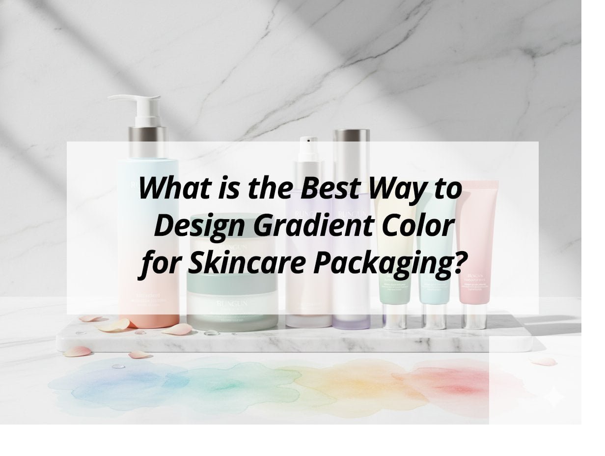
In the fast-paced world of skincare products, packaging is everything. How can you make your products stand out with gradient colors?
To design effective gradient colors for skincare packaging, choose hues that reflect your brand's identity and resonate with consumers. Effective gradients add depth, sophistication, and visual appeal, enhancing product perception and helping your brand stand out in a competitive market.
Understanding the best practices for gradient design can make the difference between your product blending in or standing out. Let’s explore these strategies in depth.
What are the best colors for skincare packaging?
Choosing the right colors impacts not only the product's appeal but also consumer perceptions of quality and efficacy.
The best colors for skincare packaging1 convey purity, freshness, and elegance. Soft pastels, earthy greens, and calming blues are popular for their ability to evoke these qualities. Balance is key; selecting complementary colors will highlight the product while maintaining visual harmony.
Unlock the full potential of your packaging by understanding the emotional resonance colors have with consumers and how they align with your brand values.
Crafting the Ideal Color Palette for Skincare
Understanding the significance of color is crucial, as it affects consumer engagement2 and brand identity. Consideration should be given to both aesthetics and psychology, as each hue sends a specific message.
Steps to Develop an Effective Color Palette
- Analyze Competitors: Understand what works in the skincare industry. Identify the successful color schemes used by leading brands.
- Brand Alignment: Ensure color choices align with your brand's mission and values. A brand that emphasizes natural ingredients might choose earthy tones.
- Market Research: Conduct surveys or focus groups to understand what your target audience finds appealing.
- Psychology of Color: Leverage emotional responses evoked by colors. For instance, green signifies natural and organic, while blue suggests trust and calmness.
Example of Popular Skincare Colors and Their Perceptions
| Color | Perception |
|---|---|
| Soft Blue | Calm and trust |
| Mint Green | Fresh and natural |
| Light Pink | Gentle and soothing |
| White | Pure and clean |
Creating a palette that resonates with consumers can lead to stronger brand recognition and loyalty.
Are gradients outdated in 2025?
With design trends constantly evolving, it's essential to reassess the viability of gradients in your packaging.
Gradients remain relevant in 2025 due to their ability to add depth and modernity. While the trend has evolved, incorporating subtle shifts and dynamic color ranges ensures a fresh, contemporary look. Gradients have moved beyond simple linear transitions to more complex and artistic configurations.
Learn why gradients continue to be pivotal in visual branding and how they can be leveraged to keep your packaging appealing and relevant.
The Evolution of Gradient Designs
Gradients have undergone substantial transformation in recent years. They now offer a range of design possibilities that can elevate packaging aesthetics.
How Gradients Have Changed
- From Linear to Complex: Early gradients were simple and linear. Today, designers use radial and angular gradients, offering a 3D effect.
- Color Variety: The recent shift includes multi-color gradients, creating richer and more intricate designs.
- Digital Tools: With advanced software, precision in gradient design is attainable, providing more innovative and unique results.
Benefits of Using Gradients Today
- Dynamic Appeal: Gradients offer an attractive, eye-catching appeal that flat colors lack.
- Brand Differentiation: Unique gradients can distinguish your product in a crowded market.
- Emotion and Depth: They add emotional depth, creating a richer consumer experience.
Utilizing gradient designs effectively can help maintain your brand's position at the forefront of the industry.
Should your brand designs use solid or gradient color?
Deciding between solid or gradient colors can influence consumer perception and brand aesthetics.
Choosing between solid or gradient colors reflects your brand's image and product message. Gradients offer depth and modernity, while solid colors can deliver a clean, straightforward message. Your choice should align with the product’s market and the intended customer experience.
Understand the strategic advantages of solid versus gradient color applications and how they can be tailored to fit your brand's unique story.
Evaluating Solid vs. Gradient Colors
The decision between solid and gradient colors in packaging design involves understanding your brand's needs and consumer expectations.
Advantages of Each
Solid Colors:
- Simplicity: Offers a minimalist look, appealing in its clarity.
- Focus: Can direct focus to brand messaging or specific product features.
Gradient Colors:
- Modernity: Provides a contemporary, cutting-edge aesthetic.
- Interest: Adds complexity, engaging customers through visual storytelling.
When to Use Each Type
- Use solid colors when simplicity and clarity of message are paramount.
- Employ gradients to highlight innovation and modernity, especially if your target demographic is younger or tech-savvy.
Choosing the right approach can greatly impact how your brand is perceived, tailoring the consumer experience effectively.
Which gradient generator is the best?
Selecting the right tool can enhance your design efficiency and output quality.
Gradient generators like Adobe Color CC and Coolors offer intuitive interfaces and an array of options for creating unique packaging designs. They provide designers with control over color transitions and intensity, ensuring the final product aligns with brand aesthetics.
Insight into selecting effective design tools can streamline your creative process and elevate your product presentation.
Exploring Gradient Tools
Choosing the best gradient tool involves understanding the features and flexibility each offers.
Popular Gradient Tools
-
Adobe Color CC
- Features robust color palette creation.
- Integrates seamlessly with other Adobe products.
- Best for designers with specific software needs.
-
Coolors
- User-friendly and excellent for quick design needs.
- Offers color harmony tools ideal for beginners.
- Provides easy sharing and collaboration.
-
Gradient Hunt
- Offers a library of trendy gradients.
- Ideal for quick inspiration and application.
- Community-driven, reflecting current trends.
Factors to Consider
- Ease of Use: Ensure the tool aligns with your skill level.
- Integration: Consider compatibility with other design software.
- Community Support: Popular tools often have extensive online resources and tutorials.
Choosing the right tool aids in efficient and creative gradient design implementation.
My insights: The Best Way to Design Gradient Color for Skincare Packaging
Struggling to make your skincare brand stand out? Discover how the perfect gradient color design can elevate your packaging and captivate consumers.
Designing a gradient for skincare packaging requires alignment with brand identity, using complementary colors for harmony, and soft transitions for a calming effect. Incorporate high-quality printing3 techniques, ensure material compatibility4 and consider environmental factors to enhance aesthetic appeal and convey brand messages effectively.
Mastering Gradient Design for Skincare Packaging
Design Principles:
Gradient designs should align with the brand's identity and product message through carefully selected color palettes. Start with precise Pantone colors and consider using tools like Adobe Illustrator for mockups to visualize linear, radial, or area gradients. Important elements include creating a soothing effect with soft transitions and incorporating negative space for clarity.
Material Compatibility and Production:
Different materials require specific techniques to display gradients vibrantly. Glass or acrylic is ideal for luxurious packaging, while PETG or PP plastics suit spray or silk screen methods. It’s critical to test durability against environmental factors. High-quality printing techniques such as digital printing or spray coating, followed by UV and abrasion tests, ensure lasting impact.
Applications and Cultural Considerations:
Gradients work effectively across various containers, boosting shelf appeal. Ensure cultural meanings of colors are considered for target markets. For example, warm peach-to-rose trending colors in PET bottles can signify freshness and vitality in different regions, while cool mint or lavender gradients evoke calm and purity, aligning with product characteristics.
| Consideration | Description |
|---|---|
| Design Alignment | Brand identity, complementary colors, calm effect |
| Printing Techniques | Digital printing, spray coating, UV testing |
| Material Compatibility | Glass, acrylic, PETG, PP plastics |
Choosing the right gradient design strategies can enhance both the visual appeal and marketability of skincare packaging, making products more attractive and effective in conveying brand values.
Conclusion
Using the perfect gradient colors for skincare packaging can distinguish your product. Explore modern trends and tools to remain visually appealing and competitive.
-
Explore effective strategies for designing skincare packaging that resonates with consumers and enhances brand identity. ↩
-
Learn strategies to enhance consumer engagement through thoughtful design choices. ↩
-
Understand the best practices for achieving high-quality printing that enhances packaging appeal. ↩
-
Explore how to select the right materials for your packaging to ensure durability and aesthetic appeal. ↩