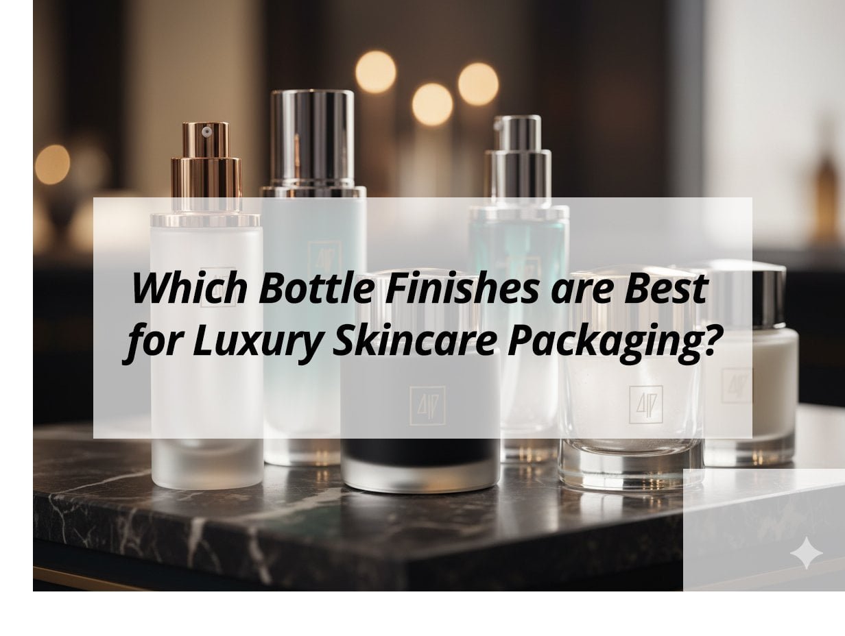
Luxury skincare demands packaging that reflects its premium quality. The finish of a bottle is key. It can elevate a product's perceived value.
The best bottle finishes for luxury skincare packaging combine aesthetics with sensory appeal. Key options include frosted glass, matte coatings, metallic accents, and high-gloss polishes. These finishes enhance visual elegance, provide unique tactile experiences, and reinforce a brand's exclusive image, making the product stand out in a competitive market.
These choices go beyond just looks. They create an experience for the consumer. They hint at the quality inside.
What are the colors for luxury packaging?
Colors play a crucial role in luxury packaging1. They communicate value, evoke emotion, and reinforce brand identity. Choosing the right color palette is essential for creating a premium feel and attracting the target audience.
Colors for luxury packaging typically include deep, rich tones and elegant metallics. Common choices are black, gold, silver, bronze, and dark shades of blue, green, and purple. White and cream also convey sophistication. These colors evoke feelings of exclusivity, quality, and timelessness, aligning with the premium nature of luxury products.
The strategic use of color helps position a product at the high end of the market. It forms an immediate visual connection with luxury.
Classic Luxury Colors
Certain colors have long been associated with luxury due to their psychological impact and historical use in high-end goods.
- Black: Black is the epitome of sophistication, power, and elegance. It suggests exclusivity and mystery. Many high-end brands use black packaging to create a bold, modern, and luxurious statement.
- Gold: Gold signifies wealth, prestige, and glamour. It adds a touch of opulence and often suggests superior quality. Gold accents are very common in luxury skincare packaging.
- Silver/Chrome: Silver conveys modernity, innovation, and understated luxury. It often pairs well with minimalist designs, suggesting precision and high technology.
- White/Cream: White represents purity, simplicity, and cleanliness. In luxury packaging, it often suggests a minimalist, sophisticated aesthetic. It can make other colors or metallic accents pop.
Deep and Rich Tones
Beyond the classics, deep and saturated colors can also communicate luxury.
- Navy Blue: This color evokes trust, stability, and professionalism. In luxury, it suggests depth and seriousness.
- Emerald Green: Green, especially dark or jewel-toned emerald, links to nature, growth, and richness. It can suggest organic luxury or precious ingredients.
- Deep Purple: Purple has historical ties to royalty and extravagance. It suggests creativity, luxury, and uniqueness.
- Burgundy/Maroon: These deep red tones convey richness, tradition, and sensuality. They are often used for classic or mature luxury brands.
Metallic Accents and Finishes
Metallic elements are almost a staple in luxury packaging. They are often used as accents rather than primary colors.
- Rose Gold: This trendy metallic combines the warmth of gold with a touch of pink. It suggests modern luxury, femininity, and sophistication.
- Bronze/Copper: These warmer metallics evoke a sense of authenticity, craftsmanship, and a natural, earthy luxury.
- Pewter/Gunmetal: Darker metallic shades suggest industrial chic, strength, and a modern, edgy luxury.
Strategic Color Combinations
Luxury packaging often uses a limited, deliberate color palette.
- Black with Gold/Silver: A timeless combination that instantly signals luxury.
- White with Gold/Silver/Rose Gold: A clean and elegant look with a touch of opulence.
- Deep Colors with Metallic Accents: For example, navy blue with silver, or emerald green with gold.
These combinations are carefully chosen to enhance the perception of exclusivity and quality.
Luxury Color Palette Examples
| Color Group | Example Colors | Associated Feelings / Traits | Application in Luxury Skincare |
|---|---|---|---|
| Neutrals | Black, White, Cream | Elegance, Sophistication, Modernity, Purity | Primary bottle color, stark contrasts |
| Metallics | Gold, Silver, Rose Gold | Wealth, Prestige, Modernity, Glamour, Innovation | Accents, caps, pumps, lettering |
| Deep Hues | Navy Blue, Emerald Green, Deep Purple, Burgundy | Trust, Nature, Royalty, Richness, Tradition | Primary bottle color, secondary accents |
The careful selection and combination of these colors are crucial for luxury skincare.
Which skincare brand has the best packaging?
Identifying the "best" skincare packaging is subjective. It depends on various factors like brand values, target audience, and aesthetic preferences. However, certain brands are consistently praised for their outstanding packaging design, setting industry benchmarks.
Brands like Aesop, La Mer, Augustinus Bader, and Drunk Elephant are often cited for having some of the best skincare packaging. Their designs stand out for their blend of aesthetic appeal, material quality, functional elegance, and strong brand storytelling. These brands effectively use minimalist designs, luxurious materials, and thoughtful details to create a premium and memorable consumer experience.
These brands successfully marry form and function, elevating their products through superior packaging.
Aesop: Minimalist and Apothecary Chic
Aesop is consistently celebrated for its distinctive packaging.
- Aesthetic: It uses dark brown glass or amber plastic bottles with simple, minimalist labels. This gives an apothecary-like, scientific feel.
- Materials: High-quality glass and durable plastic. The dark tint protects sensitive ingredients from light degradation.
- Functionality: Many products come with pump dispensers, ensuring easy and hygienic use.
- Brand Story: The understated design communicates a focus on product efficacy and natural ingredients. It suggests timeless wisdom.
Their packaging is instantly recognizable and conveys an unpretentious luxury.
La Mer: Classic Elegance and Opulence
La Mer embodies traditional luxury skincare packaging.
- Aesthetic: Its signature cream jars are typically heavy, opaque white or cream glass. They have sleek gold or silver lids. This exudes classic opulence.
- Materials: High-quality, heavy glass. The weight of the jar contributes to a luxurious tactile experience.
- Functionality: The wide-mouth jars are designed for easy access to rich creams.
- Brand Story: The packaging reinforces the brand's narrative of rarity, marine ingredients, and scientific discovery. It signals exclusivity.
La Mer's packaging is synonymous with high-end, aspirational skincare.
Augustinus Bader: Modern Science and Understated Luxury
This brand's packaging reflects its high-tech, clinical approach.
- Aesthetic: Features sleek, dark blue or silver bottles and jars with minimalist white text. This creates a high-tech, sophisticated look.
- Materials: Often uses heavy glass or high-quality, often airless, plastic bottles. These choices protect advanced formulations.
- Functionality: Airless pump dispensers are common. They protect sensitive ingredients from air exposure. This ensures product integrity.
- Brand Story: The design communicates scientific innovation and effective, results-driven skincare. It feels modern and authoritative.
Their packaging is functional and communicates scientific efficacy with understated elegance.
Drunk Elephant: Playful Modernism and Bright Colors
Drunk Elephant stands out with its vibrant and unique packaging.
- Aesthetic: Uses bright, bold, primary colors for caps and product names. The primary containers are often white, allowing the colors to pop.
- Materials: High-quality plastic. Many products use airless pumps or custom dispensing mechanisms.
- Functionality: The airless pumps and twist-up caps are designed for hygiene and ease of use. They also prevent contamination.
- Brand Story: The colorful, playful design reflects the brand's "clean-compatible" philosophy and fun approach to serious skincare. It appeals to a younger, modern audience.
Drunk Elephant's packaging is distinctive and memorable. It creates a strong visual identity.
Brands with Exemplary Skincare Packaging
| Brand | Key Packaging Traits | Aesthetic Focus | Why it's "Best" |
|---|---|---|---|
| Aesop | Dark glass/plastic, minimalist labels, pump dispensers | Apothecary chic, understated elegance | Strong brand identity, functional, protects product |
| La Mer | Heavy opaque glass jars, metallic lids | Classic opulence, aspirational luxury | Tactile luxury, timeless appeal, iconic |
| Augustinus Bader | Sleek dark bottles/jars, airless pumps, minimalist text | Modern science, clinical sophistication | Protects advanced formulas, premium feel |
| Drunk Elephant | Bright colorful caps, white containers, airless pumps | Playful modernism, clean beauty, vibrant | Distinctive, fun, highly functional |
These examples show how diverse packaging strategies can achieve "best in class" status.
What are the beauty packaging trends?
The beauty industry is constantly evolving, and packaging trends reflect these changes. Consumer values, technological advancements, and environmental concerns all shape new directions in beauty packaging design. Staying current with these trends is vital for brands.
Current beauty packaging trends strongly emphasize sustainability through recycled materials, refillable systems, and minimalist designs. Other key trends include personalized and customizable packaging, digital integration like QR codes, and a focus on unique tactile experiences. Brands are also favoring transparent ingredient communication and inclusive design to meet evolving consumer expectations.
These trends drive innovation, aiming to balance aesthetic appeal with environmental responsibility and consumer engagement.
Sustainability and Circularity
Sustainability remains the most influential trend.
- PCR (Post-Consumer Recycled) Materials: Widespread use of recycled plastics (rPET, rPP, rHDPE) and recycled glass in luxury cosmetic bottles.
- Refillable and Reusable Systems: Moving from single-use to systems where primary containers are refilled or returned. This is a major shift.
- Mono-Materials: Designing packaging from a single type of material to simplify recycling processes.
- Lightweighting: Reducing the overall amount of material used in packaging to lessen environmental impact and shipping costs.
- Waterless Formulations: Packaging for concentrated, water-free products often requires less material and is smaller.
Minimalist and Clean Aesthetics
A sleek, understated look continues to dominate.
- Clean Lines: Simple, uncluttered designs that convey sophistication and purity.
- Neutral Palettes: Often featuring white, black, gray, and earthy tones with metallic accents.
- Focus on Ingredients: Packaging highlights key active ingredients and their benefits with minimal graphic clutter.
- "Skinimalism": Packaging that reflects a simplified skincare routine with fewer, more effective products.
This aesthetic often aligns with the clean beauty movement.
Personalization and Customization
Consumers desire products that feel unique to them.
- On-Demand Customization: Packaging that allows for personalization, such as engraved names or chosen colors.
- Modular Systems: Packaging where components can be mixed, matched, or refilled to suit individual needs.
- Limited Editions: Special packaging designs or collaborations that offer exclusivity.
This trend creates a more personal connection between the consumer and the product.
Digital Integration and Smart Packaging
Technology is increasingly integrated into packaging.
- QR Codes/NFC Tags: Linking physical packaging to digital content like tutorials, virtual try-ons, or ingredient traceability.
- Augmented Reality (AR): Allowing consumers to interact with the brand or product virtually by scanning the packaging.
- IoT (Internet of Things) Packaging: For high-end luxury products, some packaging might have sensors to monitor product conditions or usage.
This enhances engagement and provides valuable data.
Tactile and Sensory Experiences
Luxury packaging focuses on more than just sight.
- Unique Finishes: Soft-touch matte, frosted glass, high-gloss, or textured surfaces.
- Weight and Feel: The heft and balance of a bottle or jar convey quality.
- Innovative Closures: Caps and pumps designed for a satisfying sound or smooth action.
These elements create a memorable unboxing and usage experience.
Inclusive Design
Packaging is becoming more inclusive.
- Ergonomic Designs: Easy-to-open caps and comfortable shapes for all users, including those with limited dexterity.
- Clearer Labels: Larger fonts or tactile indicators for accessibility.
- Diverse Representation: Packaging imagery that reflects a wide range of skin tones and identities.
This reflects a broader social shift towards diversity and accessibility.
Overview of Beauty Packaging Trends
| Trend | Focus | Impact on Packaging Design |
|---|---|---|
| Sustainability | Waste reduction, circular economy | PCR, refillable, mono-materials, lightweighting |
| Minimalist Aesthetic | Simplicity, purity, clean lines | Less clutter, neutral colors, focus on ingredients |
| Personalization | Individual expression, unique experiences | Customizable elements, modular designs |
| Digital Integration | Connectivity, interactive experiences | QR/NFC, AR, traceability features |
| Sensory Experience | Touch, feel, unboxing satisfaction | Unique finishes, material weight, thoughtful closures |
| Inclusive Design | Accessibility, diverse representation | Ergonomic shapes, clear labeling, diverse imagery |
These trends show a multi-faceted approach to modern beauty packaging.
What color is best for beauty products?
Choosing the "best" color for beauty products is not about a single color. It is about strategic color choices that align with the product's function, brand identity, and target audience. Different colors evoke different emotions and messages.
The best color for beauty products depends on the brand's message and target consumer. Generally, colors that evoke purity (white, pastels), luxury (black, gold, silver), nature (greens, browns), or vibrancy (brights for makeup) are popular. The most effective colors communicate product benefits, enhance shelf appeal, and create an emotional connection with the intended user.
A successful color choice powerfully reinforces the product's identity and attracts its ideal customer.
Colors for Purity and Cleanliness
Many skincare and "clean beauty" products use colors that suggest purity.
- White: Represents cleanliness, simplicity, and freshness. It is often used for dermatologist-recommended products or those with minimal ingredients.
- Light Blue/Pastels: These gentle colors evoke calmness, hydration, and softness. They are popular for sensitive skin lines or moisturizing products.
- Translucent/Clear: Allowing the product color to show through packaging can signal purity and transparency, especially for serums or gels.
Colors for Luxury and Sophistication
For high-end beauty products, colors convey opulence and exclusivity.
- Black: As discussed, black is timeless for luxury, power, and elegance.
- Gold/Silver/Rose Gold: Metallic accents are crucial. They symbolize wealth, quality, and glamour.
- Deep Jewel Tones: Colors like emerald green, sapphire blue, or amethyst purple can suggest richness and precious ingredients.
- Matte Finishes with Metallics: A matte black or white finish combined with gold lettering creates a sophisticated contrast.
Colors for Natural and Organic Products
Brands focusing on natural or organic ingredients often use earthy and muted tones.
- Greens: Various shades of green, from light sage to deep forest, symbolize nature, freshness, and organic properties.
- Browns/Earthy Tones: Terracotta, beige, and natural wood tones convey authenticity, rawness, and connection to the earth.
- Muted Pastels: Soft, desaturated colors can suggest gentle, natural formulations.
Colors for Vibrancy and Playfulness (Makeup)
Makeup, especially for younger audiences, often uses bright, energetic colors.
- Bright Pinks/Corals: These colors often signify femininity, fun, and youthfulness.
- Bold Primary Colors: Reds, blues, and yellows can create a dynamic, modern, and playful look.
- Iridescent/Holographic Finishes: These add a playful, trendy, and eye-catching element, especially for limited editions.
Strategic Color Psychology
The choice of color is often rooted in color psychology.
- Red: Energy, passion, urgency.
- Blue: Trust, serenity, professionalism.
- Yellow: Optimism, warmth, cheerfulness.
- Green: Nature, health, tranquility.
Understanding these associations helps brands select colors that align with their product's benefits and target audience's emotions.
Effective Color Choices in Beauty Packaging
| Color Category | Associated Message / Emotion | Typical Product Application |
|---|---|---|
| Purity/Cleanliness | Clean, fresh, simple, gentle | Skincare, sensitive formulas, natural products |
| Luxury/Sophistication | Wealth, elegance, prestige, quality | High-end creams, serums, anti-aging products |
| Natural/Organic | Earthy, pure, botanical, sustainable | Organic skincare, herbal remedies, eco-friendly lines |
| Vibrancy/Playfulness | Fun, youthful, energetic, trendy | Makeup (especially for younger demographics), body care |
Ultimately, the "best" color is one that effectively communicates the product's essence and appeals to its specific consumer base.
My Insights: Best Finishes for Luxury Skincare Packaging
Unsure which bottle finish will elevate your skincare packaging? Discover the luxurious options that enhance brand elegance and appeal.
Matte, frosted, and soft-touch finishes are ideal for luxury skincare packaging. They offer sophistication, tactile appeal, and align with sustainable trends. Glossy and metallic finishes add shine and exclusivity for a premium look.
Enhancing Luxury Skincare Packaging with Finishes
Top Finishes for Elegance:
Matte finishes offer a non-glare, sophisticated look, reducing smudges and pairing well with eco-friendly inks. Frosted finishes lend an elegant, subtle effect, often using recyclable materials. Soft-touch coatings provide a velvety, interactive feel, enhancing perceived quality.
Visual Enhancements:
Glossy finishes magnify colors and reflections, ideal for serums or toners needing standout shelf presence. Metallic and foil accents create premium, exclusive vibes with gold or silver detailing, perfect for a luxury unboxing experience.
Selection Factors:
Choose based on brand identity—opt for matte or frosted for understated elegance, glossy or metallic for bold luxury. Pair with glass bottles to preserve ingredients and convey a high-end value. Ensure compatibility with printing methods like silk screen for durability.
Finish Comparison Table:
| Finish | Characteristics | Ideal Use |
|---|---|---|
| Matte | Soft, non-glare, reduces smudges | Artisanal luxury, eco-friendly branding |
| Frosted | Elegant, subtle, recyclable materials | Elegance and sustainability |
| Soft-touch | Velvety, tactile, enhances quality perception | Premium tactile experience |
| Glossy | Amplifies colors, reflects light, bold presence | Standout shelf appeal |
| Metallic | Premium shine, exclusive accents | Luxury unboxing vibe |
Selecting the right finish involves balancing aesthetics, brand identity, and sustainability goals to create the ultimate luxury experience.
Conclusion
Luxury skincare bottle finishes favor frosted glass, matte coatings, and metallic accents for elegance and tactile appeal. Black, gold, white, and deep jewel tones are preferred for their luxurious connotations. Trends emphasize sustainability, personalization, digital integration, and sensory experiences to meet evolving consumer demands.
-
Understanding luxury packaging can enhance your brand's appeal and market positioning. ↩