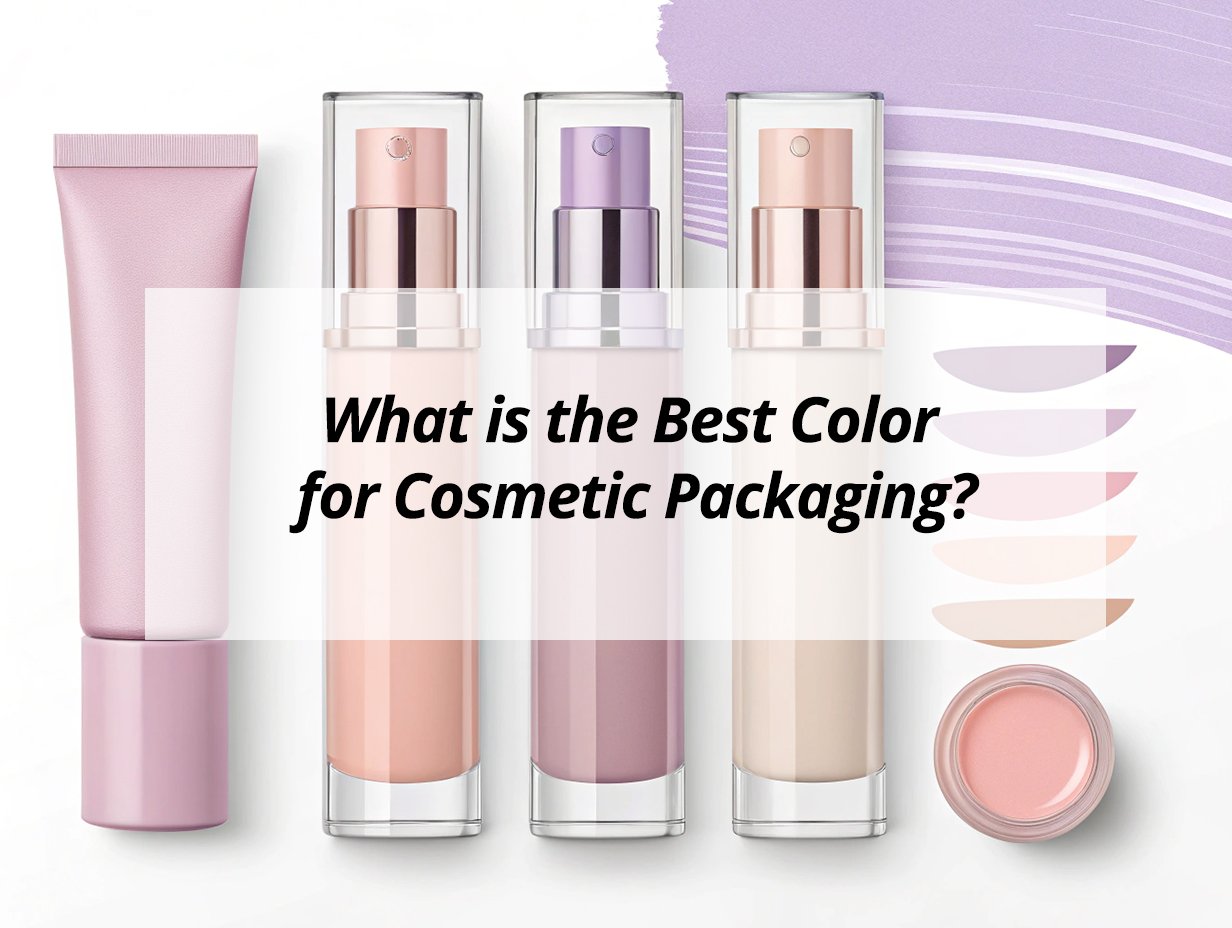
Selecting the perfect color for cosmetic packaging is crucial; it can influence customer perception and increase sales through impactful visual appeal.
Selecting the right color for cosmetic packaging relies on understanding color psychology and audience preferences. Pastel, bold, and metallic hues can strengthen brand identity and attract customers by creating an appealing visual impact, encouraging consumers to engage with the product and enhance sales potential.
Colors in packaging influence emotions and perceptions, making them a vital marketing tool.
What are the best colors for packaging?
Color choice in cosmetic packaging can drive purchasing decisions by evoking strong emotional responses. Which colors are most effective?
Pastels and neutral tones1 are ideal for skincare products, while bold colors like red and orange make beauty packaging stand out, creating strong customer connections and enhancing brand visibility.
Understanding the best colors for packaging helps align products with consumer preferences, boosting market appeal.
Dive deeper into Packaging Colors
Colors aren't merely aesthetic; they're powerful communicators. Successful brands utilize color psychology to connect with consumers on a deeper level.
Color Preferences in Cosmetic Packaging
-
Pastels:
- Convey calmness and serenity, making them perfect for skincare.
-
Bolds:
- Capture attention and express dynamism, appealing to younger audiences.
-
Neutrals:
- Offer elegance, appealing to luxury segments.
-
Metallics:
- Exude sophistication and modernism, attracting the high-end market.
Choosing colors based on demographics ensures the cosmetic package resonates well with its audience, enhancing product appeal.
Key Insights:
- Pastel colors soothe, attracting serenity seekers.
- Bold shades stimulate curiosity, perfect for adventurous buyers.
- Neutral tones reassure elegance seekers.
- Metallics signify prestige, attracting luxury consumers.
What color attracts customers more?
Effective color choice can capture the attention of potential buyers instantly. What colors are most captivating?
Bright colors such as red, orange, and yellow in cosmetic packaging attract immediate attention, stimulating emotions and enticing customers to explore the cosmetic package further.
Utilizing attention-grabbing colors enhances brand visibility, driving consumer interest and heightening purchase potential.
Customer Attraction
Understanding customer attraction through colors is key to a successful marketing strategy. The psychology of color can directly impact consumer behavior.
Influential Colors
- Red:
- Indicates energy and passion.
- Orange:
- Invites creativity and excitement.
- Yellow:
- Represents happiness and warmth.
Incorporating these colors into cosmetic packaging ignites customer interest and accelerates buying decisions.
| Color | Psychological Influence2 |
|---|---|
| Red | Passionate & energetic |
| Orange | Creative & exciting |
| Yellow | Happy & warm |
Crafting a vibrant cosmetic packaging approach will help boost brand awareness and appeal to shoppers' emotions.
What is the best packaging for skincare products?
Skincare products require thoughtful packaging to convey care and efficacy. What works best?
The best packaging for skincare products involves using soft and neutral colors. These evoke trust and purity, helping consumers associate products with effectiveness and gentleness.
Aligning skincare packaging with consumer expectations enhances trust and reinforces product quality perception.
Skincare Packaging
Effective skincare packaging goes beyond aesthetics. It conveys product benefits and addresses consumer safety concerns, building trust.
Essential Packaging Traits for Skincare
-
Soft Colors:
- Impart relaxation, crucial for conveying care.
-
Simple Design:
- Offers clarity and focuses on product benefits.
-
- Reflect sustainability, appealing to conscious consumers.
Employing soft hues in the cosmetic package alongside clear messaging establishes credibility and product efficacy.
Strategic Approach:
- Soft colors induce relaxation and care.
- Simple design emphasizes transparency.
- Eco-friendly materials depict responsibility.
A comprehensive packaging strategy not only appeals visually but also builds consumer trust through considered design elements.
What are the colors for luxury packaging?
Luxury packaging4 demands sophistication to convey exclusivity and quality. Which colors express opulence?
Luxury cosmetic packaging often utilizes rich colors like black, gold, and deep purple. These suggest exclusivity and high value, making them ideal for attracting discerning customers.
Luxury packaging uses carefully chosen colors to evoke prestige, capturing the high-end market's attention effectively.
Luxury Packaging
Creating a luxury appearance in packaging requires thoughtful color selection. The right shades can convey exclusivity and sophistication.
Luxury Color Palette
- Black:
- Denotes elegance and mystery.
- Gold:
- Suggests opulence and wealth.
- Deep Purple:
- Implies royalty and exclusivity.
Incorporating these colors into the cosmetic packaging enhances the perception of luxury and quality.
| Color | Impression |
|---|---|
| Black | Elegance & mystery |
| Gold | Wealth & opulence |
| Deep Purple | Royalty & exclusivity |
Strategically integrating these colors into cosmetic packaging helps brands stand out in competitive markets, reinforcing luxury appeal.
Luxury Branding Approach:
- Black for timeless elegance.
- Gold for lavish appeal.
- Deep purple for regal exclusivity.
Luxury cosmetic packaging must emphasize quality through strategic design choices, appealing to high-end consumer desires.
My insights: The Best Color for Cosmetic Packaging
Capture consumer attention and elevate your brand by choosing the perfect color for your cosmetic packaging that reflects your identity and resonates with your audience.
The best color for cosmetic packaging depends on brand identity, target audience, and product type. Colors like black, white, pink, gold, and green are popular for their psychological impact and market appeal.
Understanding Color Impact
Selecting the right color for cosmetic packaging involves understanding consumer perception and market trends.
| Color | Associations | Best For |
|---|---|---|
| Black | Luxury, sophistication | High-end products |
| White | Purity, simplicity | Skincare and natural products |
| Pink & Nude | Femininity, softness | Youthful or romantic lines |
| Gold & Metallics5 | Glamour, luxury | Limited editions and premium signatures |
| Green | Eco-friendliness, nature | Organic and sustainable beauty |
| Blue | Trust, reliability | Skincare products |
| Red & Orange | Energy, attention | Lipsticks and eye-catching products |
Key Factors to Consider
- Cultural Preferences: Colors may have different meanings and appeal across regions. Bright hues might be favored in some Asian markets, while muted tones may be preferred in Western markets.
- Color Combinations: Pairing black with gold suggests elegance, while white with green indicates eco-friendliness.
- Trends: Colors like "Mocha Mousse" are trending as they convey warmth and luxury.
Align your color choice with your brand’s message and market trends to ensure your packaging appeals visually and emotionally to your target audience.
Conclusion
Understanding color's role in cosmetic packaging transforms a product's market presence. Select wisely to resonate with target audiences and elevate brand identity effectively.
-
Explore how pastels and neutral tones can enhance the appeal of skincare products and attract consumers. ↩
-
Explore how these colors can stimulate emotions and drive consumer interest. ↩
-
Learn about the growing importance of sustainability in packaging and its effect on consumer preferences. ↩
-
Discover the key elements that make packaging feel luxurious and exclusive. ↩
-
Discover how metallic colors can elevate brand perception and attract high-end consumers. ↩