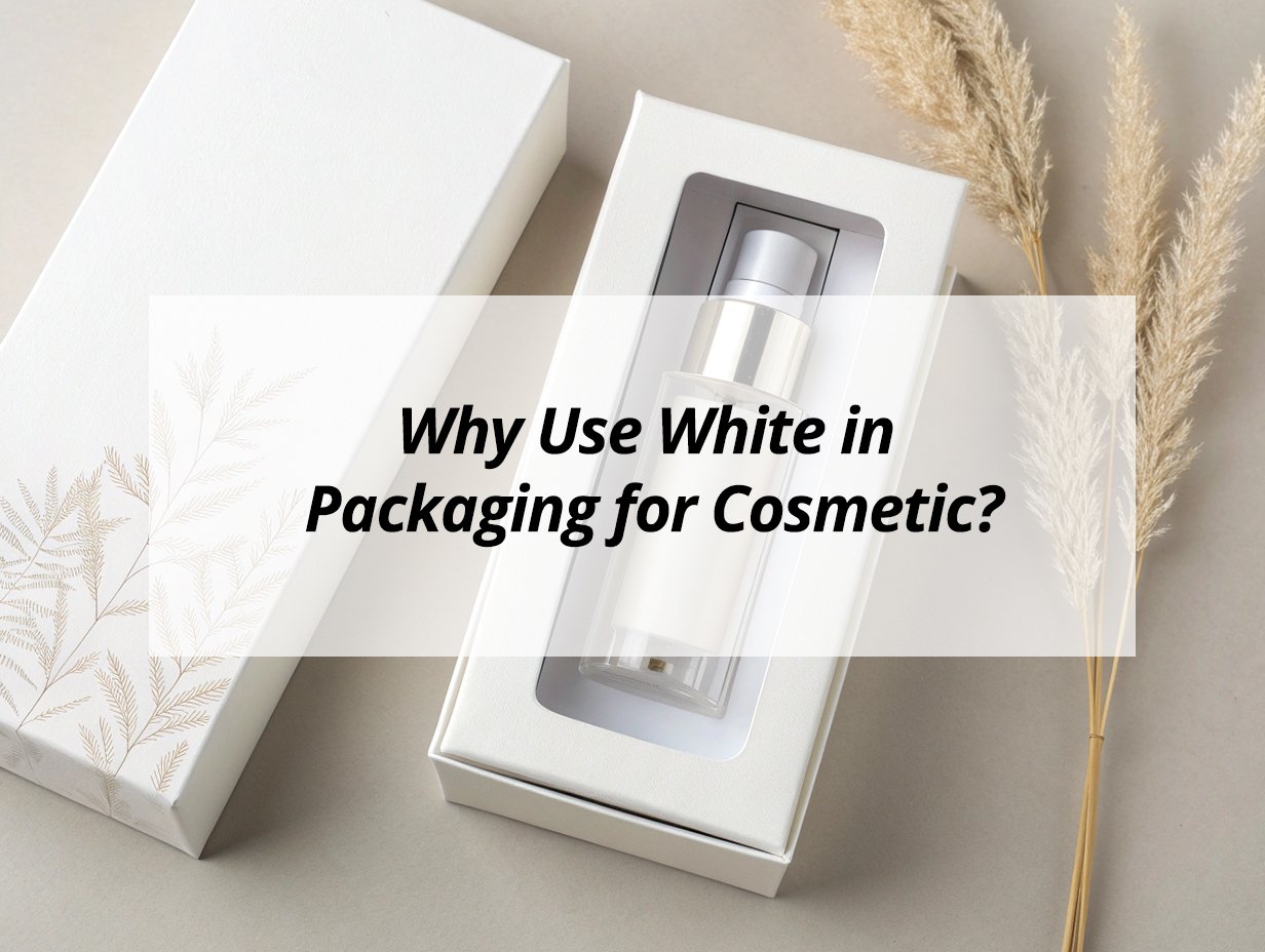
White packaging has become a dominant choice in the cosmetic industry, particularly for skincare and premium products, due to its psychological impact, aesthetic appeal, and functional advantages. This color communicates specific brand values and influences consumer perception in powerful ways.
White packaging in cosmetics signals purity, cleanliness, simplicity, and efficacy—making it ideal for skincare, medical aesthetic products, and minimalist brands seeking to communicate safety, clinical effectiveness, and premium quality while creating a clean, modern aesthetic that stands out in crowded retail environments and appeals to consumers seeking trustworthy, results-oriented products.
The strategic use of white extends beyond mere aesthetics, serving as a visual shorthand for specific product benefits and brand positioning that resonates with contemporary consumer preferences.
What is the best color for cosmetic packaging?
While white offers distinct advantages for specific product categories, the best color for cosmetic packaging1 depends on brand positioning, target audience, and product type—with black conveying luxury, pink representing femininity, green signaling natural ingredients, and gold indicating premium quality across different market segments.
The best color for cosmetic packaging varies by context: white excels for skincare and clinical products (purity, efficacy), black works for luxury makeup and fragrances (sophistication, premium quality), pink suits color cosmetics and youth brands (femininity, playfulness), green fits natural and organic lines (sustainability, authenticity), and gold enhances premium products across categories (luxury, indulgence)—with optimal color selection depending on brand identity, target demographic, product benefits, and market positioning rather than any universal "best" color for all applications.
Color Application Guide
Strategic color implementation:
Color | Best Applications | Psychological Impact | Brand Examples |
---|---|---|---|
White | Skincare, clinical, minimalist | Purity, cleanliness, efficacy | Kiehl's, The Ordinary, dermatological brands |
Black | Luxury makeup, fragrances | Sophistication, mystery, premium | Chanel, Dior, high-end cosmetics |
Pink | Color cosmetics, youth brands | Femininity, playfulness, romance | Too Faced, Benefit, mass market |
Green | Natural, organic, sustainable | Health, environment, authenticity | Aesop, Burt's Bees, eco-brands |
Gold | Premium products, luxury items | Wealth, success, indulgence | La Mer, La Prairie, luxury skincare |
Blue | Men's products, clinical lines | Trust, reliability, cleanliness | Baxter of California, clinical brands |
Determining the "best" color requires strategic alignment with brand objectives. White dominates skincare because it visually communicates the purity and efficacy consumers expect from these products. Black prevails in luxury makeup where it conveys sophistication and justifies premium pricing. Pink maintains strong presence in color cosmetics2 targeting younger female demographics. Green has carved its niche in the growing natural and organic segment. Gold serves as an accent or primary color for ultra-premium positioning across categories. The most successful brands often use color combinations rather than single colors—white packaging with gold accents suggests accessible luxury, black with metallic details indicates ultra-premium status. Understanding target audience preferences is crucial; Asian markets might prefer different color associations than Western markets. Ultimately, the best color effectively communicates brand values while resonating with the intended consumer demographic.
Why is color important in packaging?
Color is critically important in packaging because it serves as the first visual communicator, influencing purchase decisions, conveying brand identity, triggering emotional responses, differentiating products from competitors, and communicating product benefits without words—making it a powerful marketing tool that significantly impacts consumer perception and behavior.
Color is vital in packaging because it immediately communicates brand personality (luxury, fun, natural), influences emotional response (excitement, trust, calmness), drives purchase decisions (attention capture, preference formation), differentiates from competitors (shelf standout, brand recognition), and conveys product attributes (freshness, efficacy, naturalness) within seconds of visual contact, making it one of the most effective elements for attracting consumers, communicating brand values, and ultimately driving sales in crowded market environments.
Color Impact Dimensions
Multifunctional importance:
Impact Area | Specific Functions | Consumer Response | Business Outcome |
---|---|---|---|
First Impression | Immediate recognition, attention grabbing | Quick assessment, curiosity generation | Initial engagement, shelf standout |
Emotional Connection | Mood influence, feeling creation | Trust building, desire generation | Brand loyalty, repeat purchases |
Information Conveyance | Benefit signaling, usage indication | Quick understanding, need identification | Appropriate product selection |
Brand Identity | Consistency maintenance, values communication | Brand recognition, expectation setting | Equity building, premium perception |
Differentiation | Competitive distinction, uniqueness establishment | Preference formation, memorability | Market position, competitive advantage |
Color's importance stems from its immediate visual impact and psychological influence. Before consumers read any text or assess product details, color creates the first impression and establishes initial expectations. It triggers subconscious associations—white suggests purity, black conveys luxury, green implies naturalness. These associations significantly influence purchase decisions, with studies showing color alone can increase brand recognition by up to 80%. Color also drives shelf standout in crowded retail environments, helping products capture attention amid competition. Beyond initial attraction, color supports brand identity maintenance, ensuring consistency across product lines and reinforcing brand values. It also serves practical functions—color coding different product variants within a line, indicating usage (night creams often in darker packaging), or signaling specific benefits (blue for cooling effects). The strategic use of color ultimately bridges the gap between product functionality and consumer perception, making it an indispensable packaging element.
What do the colors of packaging mean?
Packaging colors carry specific psychological meanings and cultural associations: white signifies purity and simplicity, black represents luxury and sophistication, blue conveys trust and reliability, green indicates natural and environmental values, red attracts attention and creates urgency, yellow suggests optimism and clarity, and purple symbolizes creativity and luxury—each color communicating distinct messages to consumers.
Packaging colors mean: white (purity, cleanliness, simplicity, efficacy), black (luxury, sophistication, elegance, mystery), blue (trust, reliability, calmness, professionalism), green (natural, fresh, environmental, healthy), red (energy, excitement, urgency, passion), yellow (optimism, happiness, clarity, attention), and purple (creativity, luxury, spirituality, innovation)—with these associations influencing consumer perception, purchase decisions, and brand positioning based on psychological principles, cultural contexts, and industry conventions that have evolved over time through marketing practices and consumer experiences.
Color Meaning Dictionary
Comprehensive associations:
Color | Primary Meanings | Secondary Associations | Industry Applications |
---|---|---|---|
White | Purity, cleanliness, simplicity | Modern, clinical, minimalist | Skincare, pharmaceuticals, premium products |
Black | Luxury, sophistication, elegance | Powerful, mysterious, formal | Luxury goods, premium cosmetics, high-end |
Blue | Trust, reliability, calmness | Professional, peaceful, dependable | Healthcare, technology, corporate products |
Green | Natural, fresh, environmental | Healthy, peaceful, prosperous | Organic products, eco-brands, health foods |
Red | Energy, excitement, urgency | Passion, danger, attention | Food, entertainment, promotions |
Yellow | Optimism, happiness, clarity | Warm, friendly, caution | Children's products, clearances, attention |
Purple | Creativity, luxury, spirituality | Mysterious, innovative, royal | Beauty products, innovative items, premium |
Color meanings derive from psychological research, cultural traditions, and learned associations. White's association with purity stems from its connection to cleanliness and medical environments. Black's luxury connotations come from formal wear and high-end products. Blue's trustworthiness association relates to its presence in corporate and professional contexts. Green's natural connections originate from its obvious environmental associations. These meanings aren't universal—cultural differences significantly impact color interpretation. White represents mourning in some Eastern cultures while symbolizing purity in Western contexts. Red signifies luck in China but danger in other markets. Understanding target market cultural associations is crucial for international brands. Beyond cultural meanings, industry conventions have developed—pharmaceuticals often use white and blue for clinical trust, while natural products use green and brown for environmental authenticity. Successful brands leverage these established meanings while sometimes challenging conventions to create distinctive positioning.
Does FDA regulate cosmetic packaging?
The FDA regulates cosmetic packaging primarily for safety and labeling compliance, focusing on material safety3 (ensuring packaging doesn't interact with products), labeling accuracy (ingredient listing, claims substantiation), and contamination prevention rather than dictating specific packaging designs, colors, or marketing aspects.
Yes, the FDA regulates cosmetic packaging regarding safety aspects: ensuring packaging materials are safe for intended use (no chemical migration into products), labeling requirements are met (proper ingredient declaration, net quantity, warning statements), and products remain uncontaminated during storage—but the FDA does not regulate aesthetic aspects, color choices, marketing claims beyond truthfulness, or specific packaging designs, focusing instead on consumer safety and accurate information rather than controlling packaging appearance or creative elements.
FDA Regulatory Scope
Packaging oversight areas:
Regulatory Area | FDA Requirements | Compliance Focus | Enforcement Approach |
---|---|---|---|
Material Safety | Non-reactive materials, safety assurance | Consumer protection, product integrity | Reactive based on complaints, inspections |
Labeling Accuracy | Ingredient declaration, quantity accuracy | Truthful information, consumer awareness | Mandatory requirements, periodic inspections |
Contamination Prevention | Adequate protection, preservation maintenance | Product safety, quality maintenance | Good Manufacturing Practice requirements |
Claim Substantiation | Truthful advertising, evidence-based claims | Marketing integrity, consumer trust | Post-market surveillance, complaint response |
Manufacturing Standards | GMP compliance, quality control | Consistent quality, safety assurance | Inspection-based, facility audits |
The FDA's cosmetic packaging regulation focuses on safety and truthfulness rather than controlling design choices. Packaging materials must be "suitable for intended use" meaning they shouldn't interact with cosmetic formulations or leach harmful substances. This is particularly important for active ingredients or certain formulations that might interact with packaging materials. Labeling regulations require accurate ingredient lists in descending order, proper net quantity statements, and warning labels where necessary (e.g., hair dye warnings). The FDA also expects packaging to adequately protect products from contamination. However, the agency doesn't approve packaging before market entry—regulation occurs through post-market surveillance, inspections, and response to consumer complaints. This means brands have significant freedom in packaging design, color selection, and marketing aspects as long as they meet safety requirements and don't make false claims. Understanding this regulatory framework helps brands innovate within compliance boundaries.
What are the labeling requirements for cosmetics?
Cosmetic labeling requirements include ingredient declaration in descending order, identity statement (product name), net quantity disclosure, manufacturer information, warning statements where applicable, usage directions if necessary, and claims substantiation—all presented in specific format and language requirements to ensure consumer safety and informed purchasing decisions.
Cosmetic labeling requires: ingredient listing in descending concentration order, product identity statement (what the product is), net quantity declaration (weight/volume), manufacturer/distributor information, warning statements (for potential hazards), usage directions (if necessary for safe use), and all information in English (for US market)—with specific format requirements regarding font size, placement, and prominence to ensure consumers receive accurate, understandable information about product composition, usage, and safety considerations before purchase.
Labeling Requirement Details
Comprehensive compliance elements:
Requirement | Specifics | Purpose | Compliance Considerations |
---|---|---|---|
Ingredient Declaration | Descending order, INCI names | Consumer information, allergy awareness | Complete accuracy, proper nomenclature |
Identity Statement | Common product name | Clear product identification | Avoid misleading names |
Net Quantity | Weight/volume, dual units | Value comparison, quantity awareness | Accurate measurement, proper placement |
Manufacturer Info | Name, address, contact | Responsibility identification, consumer contact | Complete information, current details |
Warning Statements | Specific hazards, precautions | Safety communication, liability reduction | Mandatory for certain ingredients |
Usage Directions | Application instructions, precautions | Proper use guidance, safety enhancement | Clarity, comprehensiveness |
Language Requirements | English primary, other languages optional | Market understanding, regulatory compliance | Readability, font size compliance |
Labeling requirements ensure consumers make informed choices. Ingredients must be listed using International Nomenclature of Cosmetic Ingredients4 (INCI) names in descending order of concentration, with fragrances and flavors specifically identified. The net quantity must be stated in both metric and US customary units. Manufacturer information must include the legal business name and address. Warning statements are required for products that may be hazardous if misused, such as hair dyes requiring patch test warnings. All information must be prominently displayed with minimum font size requirements for readability. Beyond these mandatory elements, brands should ensure all claims are truthful and substantiated. While the FDA doesn't pre-approve labels, non-compliance can result in regulatory action, including product seizure or injunction. Many brands also include voluntary information like cruelty-free certifications, recycling symbols, or marketing copy, but these must not conflict with or obscure mandatory information. Proper labeling protects both consumers and brands while ensuring market transparency.
Conclusion
White packaging serves specific strategic purposes in cosmetics—communicating purity, efficacy, and premium quality—while color selection overall must consider psychological impact, brand positioning, and regulatory compliance, with white particularly effective for skincare and clinical products where cleanliness and trust are paramount considerations.
-
Explore this resource to understand how to effectively design cosmetic packaging that resonates with consumers. ↩
-
Stay updated on the latest trends in color cosmetics packaging to enhance your product appeal. ↩
-
Exploring material safety in cosmetic packaging helps brands choose safe materials, protecting consumers and enhancing product quality. ↩
-
INCI provides standardized ingredient names; understanding it is crucial for accurate labeling and consumer transparency. ↩