Mismatched cosmetic packaging makes even the best formula look cheap and unprofessional. If your bottle and cap colors do not align, you risk losing customer trust and sales.
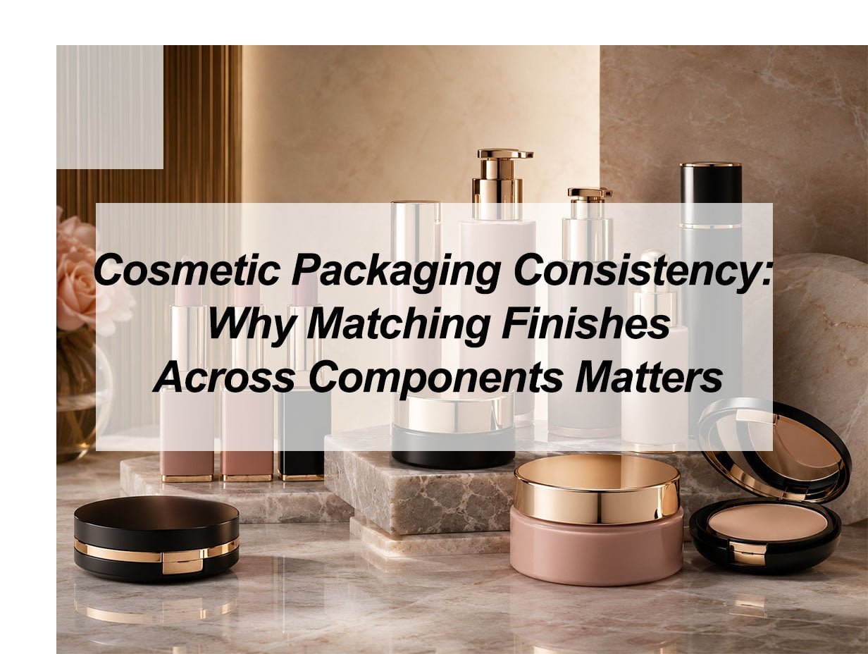
Consistent packaging finishes ensure your brand looks high-end and professional. When all components match perfectly in color and texture, it builds buyer confidence and allows you to justify a premium price for your products.
I have spent years watching brand owners struggle with the final look of their products. They often pick a great bottle but find a cap from a different source that looks slightly off. This small error can ruin the entire brand image. In the wholesale world, consistency is not just a detail; it is the foundation of your success. I want to help you understand how to get this right every time.
What are the three main problems with packaging?
Many brands face huge losses because they overlook the technical side of production. When components do not fit or look different, you end up with unsellable inventory and angry customers.
The three main problems with packaging are material incompatibility, inconsistent surface finishes, and poor structural integrity. These issues lead to product leaks, mismatched colors across different plastic parts, and damage during the shipping process.
Material and Color Drift Issues
One of the hardest things to manage in my factory is color consistency across different materials. For example, if you want a "Rose Gold" finish, it will look different on an ABS cap than it does on a PP bottle. This is because every plastic resin absorbs and reflects light differently. I call this "color drift." If you do not test these materials together under the same light, the final set will look like it was thrown together from spare parts.
Structural Failures and Leaks
A beautiful bottle is useless if it leaks. I have seen many cases where the screw thread on a lotion bottle does not perfectly match the pump. This often happens when a buyer sources the bottle from one supplier and the pump from another. Precision is key. I use our 10 injection molding machines to ensure every piece fits exactly. If the mold is even 0.1mm off, the product might leak during air travel or long-distance shipping.
Surface Coating Durability
Nothing hurts a brand more than a silver coating that peels off in the customer's hand. This usually happens because the surface was not cleaned or treated correctly before the electroplating process. It makes the product look old and poorly made. I always tell my clients that the preparation of the plastic is just as important as the final spray.
| Problem Type | Common Cause | Business Impact |
|---|---|---|
| Color Mismatch | Using different resins (PP, ABS, PET) | Damages brand luxury perception |
| Mechanical Leakage | Poor mold precision or mismatched threads | High return rates and lost inventory |
| Finish Peeling | Improper surface tension or bad coating | Customer complaints and bad reviews |
What are the factors affecting packaging?
External factors can destroy even the most expensive designs. If you do not consider heat, light, and chemicals, your packaging will fail long before it reaches the customer.
Factors affecting packaging include material selection, environmental conditions, manufacturing precision, and chemical compatibility. Understanding how plastics like PET or ABS react to heat and chemicals is vital for maintaining long-term quality.
Chemical Compatibility Challenges
Not every cream can go into every jar. Some active ingredients in skincare can react with plastic. I once saw a client’s serum literally melt the inside of a plastic bottle because it contained high levels of essential oils. You must always perform a compatibility test. We put the formula inside the container for several weeks in a high-heat room to see if the plastic softens, changes color, or cracks.
Environmental Stress and UV Light
Sunlight and heat are very dangerous for cosmetic packaging. If you ship products to hot regions like the Middle East or South America, the heat inside a shipping container can reach very high levels. This heat can cause the plastic to warp or the labels to peel off. I often suggest using a UV-resistant coating. This extra layer acts like a shield. It keeps the white plastic from turning yellow and keeps the metallic finishes from fading.
Production Stability and Equipment
The quality of the machines matters. If a factory uses old equipment, the temperature fluctuates. This means the plastic flows differently into the mold. My 10 injection molding machines are kept at stable temperatures to ensure every batch is the same. If the production is not stable, one batch of lip gloss tubes might be slightly larger than the next, making the caps feel loose.
Key Factors to Monitor
- Resin Grade: Always use virgin plastic, not recycled scraps, for better finish.
- Mold Cooling Time: If you rush the cooling, the parts will warp.
- Humidity: High moisture in the factory can cause bubbles in the spray paint.
- Logistics Stress: Vibration during shipping can scratch soft-touch finishes.
What are the 6 main reasons for packaging a product?
Packaging is much more than a simple box or bottle. It is a multi-functional tool that protects your formula and tells your brand story to every buyer.
The six main reasons for packaging are protection, containment, information, marketing, convenience, and security. Proper packaging keeps the product safe from germs while helping customers understand how to use it and why they should buy it.
Protection and Formula Preservation
The primary job of any vacuum bottle or cream jar I produce is to keep the product safe. Air and light can kill the active ingredients in your skincare. For example, Vitamin C turns brown very quickly when exposed to air. We use airless pump technology to ensure no air ever enters the bottle. This protection extends the shelf life and makes sure the customer gets the results they paid for.
Marketing Appeal and Brand Story
I believe that your packaging is the first thing a customer buys. They see the gold foil or the matte black finish and feel a certain way about your brand. Consistent finishes across your whole line—from eyeliner tubes to eyeshadow cases—show that you are a professional company. It creates a "family look" that makes people want to buy the whole set instead of just one item.
Convenience and User Experience
Packaging must be easy to use. I focus on how a cap feels when it opens. Does it have a satisfying "click"? Is the pump easy to press with one hand? If a customer struggles to get the product out, they will not buy it again. We design our components to be ergonomic. This means they fit naturally in the hand and work smoothly every time.
The 6 Pillars of Packaging Functionality
| Reason | Description | Importance |
|---|---|---|
| Protection | Blocks UV light, air, and bacteria | High |
| Containment | Keeps the liquid or powder inside safely | Critical |
| Information | Shows ingredients, expiry dates, and usage | Required by Law |
| Marketing | Attracts the eye and builds brand value | High |
| Convenience | Makes the product easy to carry and use | Medium |
| Security | Tamper-evident seals and tracking codes | Medium |
What are the key elements of aesthetically pleasing packaging design?
Visual harmony is what separates a luxury brand from a budget one. If your packaging elements do not work together, you lose the chance to make a great first impression.
Aesthetically pleasing packaging relies on color harmony, texture consistency, shape, and typography. Using matching finishes like soft-touch matte or high-gloss metallic across your entire product line creates a unified and premium appearance.
Achieving Perfect Color Harmony
When I work on a new line of lipstick tubes and lip gloss tubes, I start with color harmony. It is not enough to just use "blue." You must decide if it is a matte blue or a metallic blue. If you mix these finishes randomly, the set looks messy. I recommend using a master color chip. We use this chip to check every component—the cap, the bottle, and even the pump—to make sure they all match under natural and office light.
The Importance of Tactile Texture
How a bottle feels is just as important as how it looks. Many of my customers love "soft-touch" coating. It makes plastic feel like silk or velvet. This texture adds a sense of luxury without adding a lot of cost. When a buyer picks up a heavy-wall cream jar with a smooth finish, they perceive the product as being more valuable. I always suggest matching the texture across the whole line so the user has the same experience with every product.
Shape and Silhouette Consistency
The shapes of your components should belong to the same "design language." If your lotion bottle is round and soft, your air cushion case should not have sharp, aggressive corners. Keeping a consistent silhouette helps the products look like they belong together on a store shelf. This visual balance is what makes a brand look established and trustworthy. I use 3D modeling to show my clients how different shapes will look together before we open the molds.
Design Element Checklist
- Color Match: Ensure all parts match the same Pantone code and finish style.
- Finish Type: Choose between Matte, Glossy, Frosted, or Metallic.
- Weight: Use thicker walls or metal weights to give a "premium" feel.
- Printing: Match the gold foil or silk screen ink across all items.
- Proportion: Ensure the cap size looks balanced compared to the bottle body.
My insights: Why Uniform Packaging Finishes Define Brand Authority
Mismatched packaging finishes erode brand trust and signal low quality. Don't let inconsistent caps and bottles devalue your premium formula; unified finishes are the key to professional, high-end market positioning.
Matching finishes across cosmetic components—caps, pumps, and bottles—is essential for visual harmony and perceived luxury. Consistent textures (matte, gloss, or satin) reinforce brand recognition and build consumer trust by signaling intentional, high-quality manufacturing. This cohesion prevents a "mismatched" look, ensuring the product feels like a unified premium experience.
The Strategic Synergy of Unified Packaging Aesthetics
Achieving finish consistency is a sophisticated technical challenge that separates market leaders from budget competitors. Because a cosmetic set often involves disparate materials—such as a glass jar, a PP plastic cap, and an aluminum pump—the way light reflects across these surfaces varies wildly. Brands must move beyond simple color matching to "texture synchronization." When finishes are perfectly aligned, it reduces "visual friction," allowing the consumer to focus on the brand's story rather than distracting manufacturing discrepancies.
Psychographic Impact of Specific Finishes
| Finish Type | Psychological Perception | Brand Positioning |
|---|---|---|
| High Gloss | Energy, radiance, cleanliness | Clinical or youthful luxury |
| Matte | Sophistication, mystery, modernism | Premium, "indie" niche, or eco-conscious |
| Soft-Touch | Comfort, intimacy, high-value | Sensorial, boutique, or prestige skincare |
| Metallic | Authority, durability, tech-forward | Anti-aging or high-performance science |
Beyond Aesthetics: Technical and Commercial Risks
Critical thinking reveals that finish inconsistency is often a symptom of fragmented supply chains. Utilizing multiple vendors for different components increases the risk of "batch-to-batch" drift. For B2B buyers, securing a single source of truth for finish standards is vital; otherwise, product photography and shelf presence will appear disorganized, ultimately weakening the brand’s ability to command a premium price point. Consistent finishes don't just look better—they prove industrial mastery.
Conclusion
Consistency in cosmetic packaging is the bridge to professional branding. By controlling materials and production factors, you ensure a high-quality look that wins customer trust and drives long-term sales success.