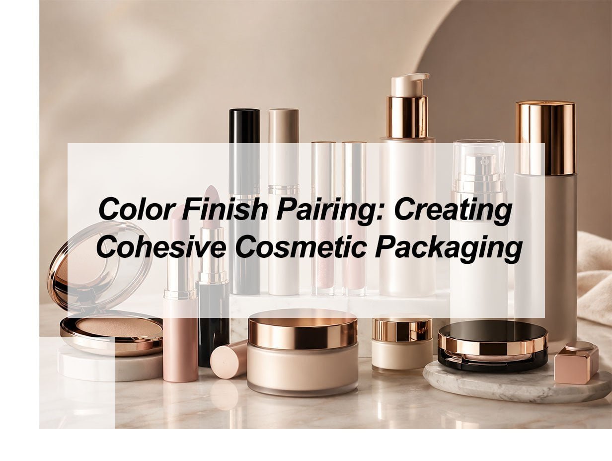
Mismatched colors and poor finishes make your cosmetic line look cheap and unprofessional. This lack of cohesion drives away high-value buyers and kills your brand's credibility before the customer even tries the product. I will show you exactly how to pair colors and finishes to create a premium, unified look.
To create cohesive cosmetic packaging, you must match color psychology with the right material finishes like matte, glossy, or metallic. Using a neutral base color combined with high-contrast accents ensures your products look professional and expensive. This strategy helps B2B buyers build trust and move inventory faster in competitive markets.
I have worked with many brand owners who choose great colors but pick the wrong finishes. The result is always the same: a product that looks like a toy instead of a luxury item. If you want to avoid these costly mistakes and learn the logic behind professional design, keep reading. I will share my experience from running a factory and helping buyers across the globe.
What are the best colors for skincare packaging?
Many skincare brands fail because their bottles look "dirty" or "busy." When the color is wrong, people do not trust that the ingredients are safe for their skin. You need to pick colors that make a customer feel safe and refreshed immediately.
White, soft blue, and sage green are the best colors for skincare packaging. White represents purity and cleanliness. Soft blue suggests hydration and water. Sage green signals natural and organic ingredients. These shades work perfectly for airless bottles, lotion bottles, and cream jars to build immediate consumer trust.
Why Cleanliness Wins in Skincare
In my factory, I see thousands of orders every month. The most successful skincare lines usually stick to a very clean palette. I remember a client from Saudi Arabia who wanted a very bright, neon orange for a face cream. I advised against it. Why? Because neon colors do not look "medical" or "healing." We switched the order to a crisp, pearl white with a matte finish. The final product looked ten times more expensive. When you use white, it shows you have nothing to hide. It makes the product feel clinical and high-quality.
Matching Colors to Product Benefits
You should always match your packaging color to what the product does. This is basic logic that many people miss. If you are selling a cooling eye gel, use a light, icy blue. If you are selling a botanical night cream, use a soft green. This helps the buyer understand the product without reading the fine print.
The Impact of Material Texture
The finish you choose is just as important as the color. I often recommend matte finishes for skincare. A matte white bottle feels soft, like skin. It also hides fingerprints, which keeps the bottle looking new on a bathroom shelf. Glossy finishes can look good, but they sometimes feel like cheap plastic if not done correctly. At our facility, we use 10 injection moulding machines to ensure the surface of every bottle is perfectly smooth. This consistency is what professional buyers look for.
| Color | Recommended Product | Visual Message |
|---|---|---|
| Pure White | Daily Moisturizers | Clean and Safe |
| Sky Blue | Hydrating Serums | Fresh and Wet |
| Sage Green | Organic Creams | Natural and Calm |
| Pale Pink | Calming Lotions | Gentle and Soft |
What is a complementary color scheme makeup?
Makeup packaging needs to be exciting, but many brands make the mistake of using too many random colors. This makes the brand look messy and confusing. A complementary scheme provides the "pop" you need while keeping the brand looking like a complete set.
A complementary color scheme uses colors that are opposites on the color wheel, such as purple and gold or blue and orange. This creates a high level of contrast. In makeup packaging, it makes items like lipstick tubes and eyeshadow cases stand out on a shelf and appear more vibrant to the eye.
Creating Visual Contrast That Sells
I once helped a buyer who was struggling to sell her lip gloss line in Southeast Asia. The packaging was a dull grey. It was boring. We changed the tubes to a deep royal purple and added a bright gold logo. These are complementary colors. The difference was night and day. The contrast made the gold logo look much brighter than it actually was. This is a simple trick of physics. When you put two opposite colors next to each other, they both look more intense. This is exactly what you want for makeup.
Using Metallics as a Second Color
In the makeup world, one of your complementary "colors" should often be a metal finish. For example, if your primary tube color is a matte navy blue, use a copper or rose gold for the cap or the printing. These are opposites on the color wheel. The metallic finish adds a layer of luxury that a flat color cannot provide. It makes the buyer feel like they are getting a premium item at a wholesale price.
Practical Tips for Makeup Lines
- Dominant Color: Pick one main color for the body of the tube or case.
- The Accent: Use the complementary color only for the logo, the rim, or the button.
- Consistency: Use the exact same shades across your entire line of eyeliner and lash tubes.
- Lighting: Remember that gold looks different under store lights than it does in a warehouse.
I always tell my clients to look at their products as a family. Your lipstick tube and your air cushion case should look like they belong together. Using a consistent complementary scheme is the easiest way to achieve this. It shows the buyer that you have a clear vision for your brand.
| Primary Base | Complementary Accent | Product Example |
|---|---|---|
| Matte Black | Shiny Silver | Eyeliner Tube |
| Deep Purple | Lemon Gold | Eyeshadow Case |
| Forest Green | Copper/Bronze | Lip Gloss Tube |
| Royal Blue | Bright Orange-Gold | Lipstick Tube |
What is the best color for packaging?
If you pick a color just because it is "trendy" today, you might have a warehouse full of ugly products next year. Trends change, but brand logic stays the same. You need a color strategy that works for the long term and fits almost any logo or design.
Black and white are the best colors for cosmetic packaging. White is the top choice for skincare because it feels clean and professional. Black is the best for makeup because it feels heavy, expensive, and powerful. Both colors act as a perfect canvas for any customized logo or metallic finish.
The Versatility of Neutral Bases
I strongly suggest that new brands start with black or white bases for their vacuum bottles and jars. There is a very practical reason for this. It is much easier to keep colors consistent in mass production when you use these standards. If you try to match a very specific shade of "sunset peach" across ten different types of plastic tubes, you will have problems. Black and white are reliable. They always look the same, and they never go out of style.
Why Quality Matters More Than Color
I have seen brands use beautiful colors on cheap, thin plastic. It never works. A high-quality white bottle feels solid and premium. A cheap white bottle looks like a milk carton. In my factory, we focus on superior quality first. We make sure the walls of our cream jars are thick and the finish is flawless. When the quality is high, even a simple black bottle looks like a luxury item. This is the secret to winning over experienced buyers in South America and the Middle East.
Key Benefits of Sticking to Black or White
- Lower Risk: These colors appeal to almost everyone.
- Ease of Branding: Any logo color looks good on black or white.
- Faster Production: We often have these colors in stock, which means no delays for your sales season.
- Professional Look: Most high-end global brands use black or white as their primary packaging color.
If you are a company owner, you need to think about the "shelf life" of your design. Do not chase every new trend. Build a solid foundation with professional colors, and then use your logo or a unique cap finish to show your brand's personality. This is how you create a brand that lasts for decades.
What color scheme focuses on complementary colors?
Many people use the word "complementary" to mean any colors that look "nice." This is not correct in professional design. If you want your packaging to look like it was designed by a top-tier agency, you need to understand the technical side of this specific scheme.
The complementary color scheme focuses strictly on two colors that are directly opposite each other on the color wheel. This scheme is designed to create maximum visual tension and energy. It is the best choice for brands that want to appear bold, modern, and high-energy on social media and store shelves.
The Logic of Visual Tension
Why does a red logo on a green box look so sharp? It is because of visual tension. The human eye struggles to process two opposite colors at the exact same time. This creates a "vibration" that draws the eye in. I often recommend this for products that need to stand out quickly, like lash tubes or small eyeliner bottles. In a sea of products, the one with the highest contrast wins the first look from the customer.
Balancing the Scheme with Finishes
When you use a complementary scheme, you have to be careful not to make it look "loud" or "cheap." I use a simple rule: if one color is very bright, make the other one a bit darker or use a matte finish. For example, if you have a bright orange logo, put it on a deep navy blue bottle with a matte texture. This keeps the look professional while still using the power of contrast. We do this often for our clients who sell in Southeast Asia, where bold branding is very popular.
Steps to Implement This Scheme
- Step 1: Choose your primary brand color based on the emotion you want (e.g., Purple for luxury).
- Step 2: Find the exact opposite on the color wheel (Yellow/Gold).
- Step 3: Decide which color will be the "Main" and which will be the "Accent."
- Step 4: Choose textures. Try a matte base with a metallic accent.
I always check the logic of a design before we start the injection moulding process. If the colors clash in a bad way, it is a waste of material. But when you get the complementary scheme right, the results are amazing. It gives the product a "finished" look that makes buyers feel confident in their purchase. It shows that every detail, from the bottle shape to the color contrast, was carefully planned.
My insights: Mastering the Synergy of Color and Texture for Brand Authority
Inconsistent packaging finishes erode brand trust. Mismatched colors across glass and plastic create visual chaos. Master the synergy of color and finish to build a premium, cohesive, and recognizable identity.
Cohesive cosmetic packaging requires aligning color palettes with finishes that reinforce brand positioning. Use glossy finishes for vibrancy, matte for premium restraint, and metallics for luxury. Ensure consistency across materials through custom color matching and strategic "shine hierarchy," while testing under retail lighting to maintain visual harmony and readability.
Strategic Synergy: Mastering the Interplay of Light, Material, and Brand Identity
To achieve true cohesion, designers must move beyond "matching colors" to "matching light behavior." Because plastic, glass, and metal absorb light differently, a single Pantone shade will appear inconsistent across a product line unless the finish is adjusted. A "shine hierarchy" should be established to define where reflection is allowed (e.g., logos or caps) to add depth without creating visual noise.
The Psychology of Finish Pairings
The choice of finish dictates the brand's emotional volume. While gloss amplifies saturation for high-energy makeup, matte finishes provide the "premium restraint" necessary for medical-grade skincare.
| Category | Primary Goal | Recommended Color + Finish | Effect |
|---|---|---|---|
| Luxury Skincare | Sophistication | Muted Tones + Satin/Matte | Signals softness, trust, and precision. |
| High-Impact Makeup | Shelf Visibility | Saturated Pigments + High Gloss | Amplifies energy and attracts attention. |
| Sustainable Lines | Eco-Consciousness | Earth Tones + Low-Gloss/Frosted | Communicates intent without "green-washing." |
Engineering Consistency Across Materials
Critical thinking in packaging design requires testing prototypes under varied lighting—LED, daylight, and retail shelves. True cohesion allows for shade-by-shade variation in the product itself, provided the structural silhouette, typography, and accent finishes (like a signature metallic foil) remain identical across the entire collection. This creates a unified "family" feel that guides the consumer's eye effortlessly across the shelf.
Conclusion
Creating cohesive packaging is about using color logic and quality finishes. Stick to clean skincare colors and high-contrast makeup schemes. This professional approach builds brand trust and ensures long-term success in the wholesale market.