You spend months developing a beauty brand, but the final bottles arrive in the wrong shade. This small error makes your high-end product look cheap. You lose money and time immediately.
Matching custom colors is hard because plastic resins, masterbatch ratios, and light sources all change how we see color. Different materials like PP or PET absorb pigments differently. To get it right, factories must use physical Pantone chips and control the injection molding temperature during production.
Digital colors and plastics differ. I use these technical steps to ensure your cosmetic packaging matches your vision perfectly.
What are the best colors for skincare packaging?
Picking the wrong color for your cream jar can confuse your customers. If the packaging looks too aggressive or dull, they will not trust the formula inside. You lose sales because of a visual mistake.
The best colors for skincare packaging are white, soft blue, and seafoam green. White represents purity and clinical safety. Blue suggests hydration and moisture. Green indicates natural or organic ingredients. These colors tell the customer that your product is clean, effective, and safe for their skin.
The Power of Color Psychology
I often tell my clients that skincare is about trust. When a buyer looks at a shelf, they want to feel calm. White is the most common choice because it looks professional and sterile. It gives the impression that the product is a "blank slate" for the skin. If you are selling a luxury anti-aging serum, you might add gold or silver accents. These colors suggest high value and scientific advancement. But the base color should usually stay light and clean to maintain that feeling of safety.
How Material Affects Skincare Colors
The type of plastic you choose will change how these "best" colors look. For example, a soft blue on a PP (polypropylene) jar will look slightly matte and milky. The same blue on a PET (polyethylene terephthalate) bottle will look shiny and deep. You must decide if you want a glossy or a matte finish before you finalize the color.
| Skincare Category | Recommended Colors | Message to Consumer |
|---|---|---|
| Moisturizers | Light Blue, White | Hydration, Freshness |
| Organic/Vegan | Sage Green, Earth Tones | Nature, Safety |
| Luxury/Anti-Aging | Gold, Black, Deep Purple | Wealth, Results |
| Sunscreen/Vitamin C | Orange, Bright Yellow | Energy, Protection |
I suggest looking at your specific market. In places like the Middle East, gold and bold colors are very popular for luxury skincare. In Southeast Asia, buyers often prefer bright white or very light pinks. You should match your color to the local culture. I always use my machines to create small samples in different materials. This lets you see the color on the actual bottle before you buy thousands of them. It is the safest way to ensure your brand looks right in the real world.
What is the best color for packaging?
A boring bottle is an invisible bottle. If your packaging does not catch the eye, customers will walk past it without a second thought. Your brand stays on the shelf while your competitors make the sale.
Blue is the best color for packaging because it represents reliability and trust globally. It is the most popular color for both men and women. Other strong choices include white for simplicity and black for luxury. These colors have the highest success rates in attracting repeat customers.
Standing Out in a Crowded Market
I see many new brands try to use too many colors. They think more color means more attention. But usually, the opposite is true. One strong, consistent color is better for brand recognition. If you look at the biggest brands in the world, they own a specific color. Your goal is to make sure that when a customer sees that specific shade of blue or red, they think of your company.
Contrast and Readability
You also have to think about how your logo looks on the bottle. If you pick a dark green bottle and put a black logo on it, no one can read your brand name. I always recommend using high-contrast colors for your customized logos. If the bottle is dark, use white or silver silk-screening. If the bottle is light, use a bold, dark color for the text. This makes your product look professional and easy to identify.
Popular Packaging Color Options
- Blue: Builds trust and feels professional.
- Red: Creates excitement and urgency (good for lip gloss).
- Green: Suggests health and eco-friendly values.
- Yellow: Grabs attention quickly but can be hard to read.
- Black: Feels expensive and exclusive.
I have helped many buyers choose the right color for their wholesale orders. We often start with a standard color and then add a special finish. For example, a simple blue bottle looks very different if you give it a "soft touch" matte coating. It feels like velvet in the hand. This adds a physical sense of quality that matches the visual color. I use my injection machines to test these coatings all the time. It is a great way to make a standard color look like a custom high-end product.
Why is color important in packaging?
If your bottles have different shades in the same shipment, your customers will think you are selling fakes. They will worry about the quality of the product inside. One bad batch can destroy your brand reputation forever.
Color is important because it is the first thing a human brain processes when looking at a product. It creates an instant emotional connection and sets expectations for quality. Consistent color builds brand loyalty and makes your products easily recognizable on a crowded retail shelf.
The Science of Color Consistency
The biggest challenge I face in the factory is consistency. We call this "batch-to-batch" stability. If I make 10,000 lotion bottles today and another 10,000 next month, they must match perfectly. To do this, I have to use the exact same ratio of color masterbatch every time. Even a 1% change can be seen by the human eye. We use professional light boxes to check the bottles under different lighting conditions. This ensures the color looks the same in a sunlight-filled bathroom and a dimly lit store.
Avoiding the "Cheap" Look
When colors are "off," they often look muddy or gray. This happens when the plastic is not high quality or the pigment is cheap. For a B2B buyer, this is a huge risk. If you are selling to high-end boutiques, your colors must be vibrant and clear. I always check the transparency of the plastic. Some buyers want a solid color that hides the liquid inside. Others want a translucent look so the customer can see how much product is left.
| Technical Factor | Effect on Color | Solution |
|---|---|---|
| Heat | Can burn pigments | Strict temperature control |
| Resin Type | Changes clarity | Use virgin plastic only |
| Light Source | Shifts the hue | Use a standard light box |
| Wall Thickness | Thicker plastic looks darker | Maintain uniform mold design |
I spend a lot of time talking to buyers about their profit models. If you choose a very rare or difficult color, your costs will go up. I try to find a way to give you the look you want while keeping the price competitive. Consistency is the most important part of quality control. If you have ten different products like eyeliner tubes and eyeshadow cases, they should all look like they belong to the same family.
What color represents skincare?
Using the wrong color can actually push your target audience away. If your "soothing" cream is in a bright red bottle, the customer feels a sense of danger or heat. This goes against everything a skincare product should be.
White and light blue are the main colors that represent skincare. White signifies medical-grade purity and cleanliness. Light blue represents water and hydration. These colors give the consumer confidence that the product is safe to put on their skin and will provide a refreshing, healthy result.
The Trend of "Nude" and Earth Tones
Lately, I have seen a big shift toward "clean beauty" colors. These are soft browns, beige, and muted pinks. They represent skin tones and natural ingredients. Many of my customers in South America and the Middle East are moving toward this style. It feels more organic and less "chemical." If you want your brand to feel modern and eco-friendly, these are the colors you should consider. They suggest that you are not using harsh dyes or artificial ingredients.
Functional Color Coding
You can also use color to help your customers use your products. This is very common in professional skincare lines. I suggest using different colors for different skin types. This makes it easy for the buyer to find what they need. It also encourages them to buy more products because they want the "set."
- Blue labels: For dry skin (hydration).
- Green labels: For oily skin (balance).
- Red labels: For anti-aging (strength).
- Purple labels: For night use (repair).
I always tell my wholesale buyers to think about the "shelf story." When all your bottles are lined up, do they tell a clear story? I use my injection molding machines to produce samples that show how these colors work together. Since we handle everything from lipstick tubes to vacuum bottles, we can make sure the entire line is unified. This is much better than buying from five different factories and hoping the colors match. I make sure the process is simple and the results are professional.
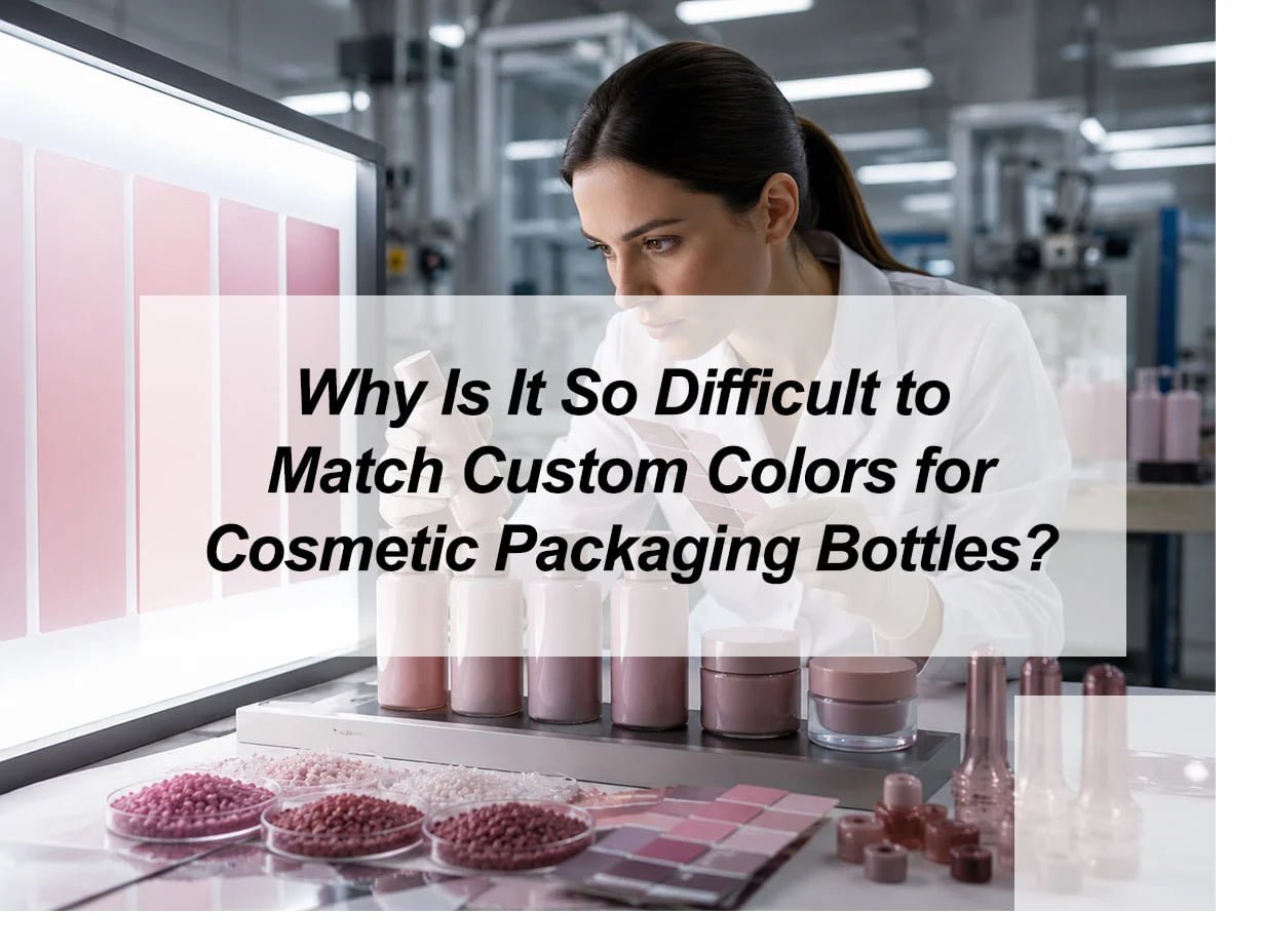
My insights: The Technical and Physical Hurdles of Custom Color Matching in Cosmetic Packaging
Frustrated by color shifts in your cosmetic line? Inconsistent packaging erodes brand trust and delays market entry. Master the complex science of pigments and polymers to ensure flawless production results.
Color matching fails because pigments react differently across resins like PET, PP, and glass. Discrepancies arise from manufacturing variables—temperature and pressure—and metamerism, where colors shift under different lighting. Unlike 2D ink on paper, 3D molded plastic involves light refraction, material thickness, and surface finishes that alter perceived shades.
Decoding the Physics of Polymer Pigmentation
Color matching is not just a visual task; it is a complex engineering challenge. When a brand selects a Pantone shade, they are choosing a color optimized for ink on paper. In contrast, cosmetic packaging involves "mass coloration" where pigments are suspended in molten resin. This transition from 2D to 3D introduces variables like resin refractive indices and cooling rates that chemically alter the final appearance. Furthermore, a single product often uses multiple materials—an acrylic cap, a PET bottle, and a PP pump—all of which react differently to the same pigment formula.
| Category | Impact on Color Precision | Key Difficulty |
|---|---|---|
| Material Chemistry | Resins (PET vs. PP) absorb light differently. | Natural base tints shift the pigment hue. |
| Surface Geometry | Curves and textures (matte vs. gloss) create shadows. | Light diffusion masks or amplifies saturation. |
| Environmental Light | Metamerism causes shifts between LED and daylight. | Colors look "correct" only in specific lab settings. |
To achieve consistency, brands must move beyond digital codes. Success requires physical "lab dips" using the exact production resin and cooling parameters to account for the unique molecular behavior of the chosen polymer.
Conclusion
Color matching is a complex technical process involving materials, heat, and light. By using strict factory controls and physical standards, we ensure your cosmetic packaging remains consistent and professional for your customers.