Cosmetic packaging can look beautiful but still send the wrong signal. When color feels mismatched, buyers may doubt the product before they touch it.
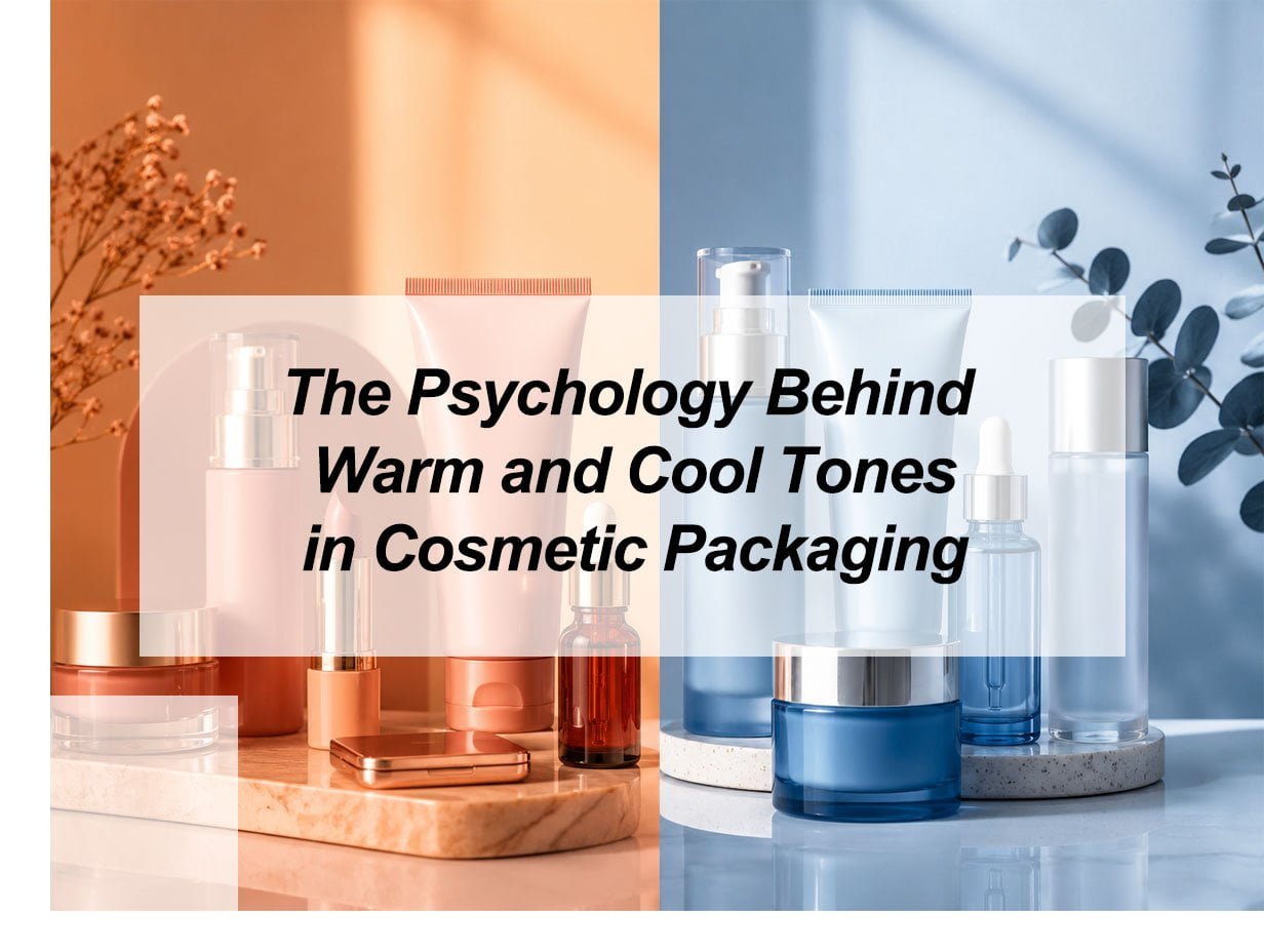
Warm and cool tones shape cosmetic packaging psychology by creating fast emotional signals. Warm tones often feel active, bold, intimate, and expressive. Cool tones often feel calm, clean, safe, and trustworthy. In beauty packaging, the right color temperature helps buyers understand the product mood, category, quality level, and brand promise within seconds. Color psychology studies how colors shape mood, attention, behavior, and perception, while packaging color can influence value, credibility, and buying expectations.
I see color as one of the first silent sales messages on a cosmetic package. A lipstick tube in warm coral says something very different from a serum bottle in icy blue. The formula may be excellent in both cases, but the buyer does not see the formula first. The buyer sees the color, the finish, the shape, and the overall mood. That first impression can support the product story or weaken it.
What Is the Psychology of Colors in Packaging?
A good package does not only protect the product. It also tells the buyer what to expect, and color does much of that work first.
The psychology of colors in packaging is the way color affects emotion, product expectation, and buying judgment. In cosmetic packaging, warm colors can suggest energy and attraction, while cool colors can suggest calmness and care. These meanings are not fixed, but they help brands guide first impressions. Packaging color is often treated as a strategic tool because hue, brightness, saturation, and contrast can shape how consumers judge value and credibility.
Color Works Before Words
I always think of packaging color as the first sentence of the product story. A buyer may not read the ingredient list first. She may not check the product claim first. She may only see a color block on a shelf, in a display tray, or on a product image. That color tells her whether the product feels gentle, bold, young, clinical, natural, luxury, or playful.
Warm tones sit closer to red, orange, yellow, coral, peach, and gold. These colors often feel active and human. They can make a product feel expressive, emotional, and close to the skin. This is why warm tones often work well for lipstick tubes, lip gloss tubes, blush cases, seasonal makeup, and products linked to confidence.
Cool tones sit closer to blue, green, purple, mint, teal, lavender, and silver-gray. These colors often feel calm, clean, and controlled. They can make a product feel safe, fresh, scientific, or soothing. This is why cool tones often work well for skincare bottles, cream jars, air cushion cases, calming formulas, and sensitive-skin products.
| Color temperature | Common emotion | Cosmetic packaging fit |
|---|---|---|
| Warm tones | Energy, passion, warmth, attraction | Lipstick, blush, gloss, limited editions |
| Cool tones | Calm, trust, freshness, safety | Serum, lotion, cream, soothing skincare |
| Neutral tones | Balance, simplicity, premium feel | Luxury lines, minimalist skincare, refill systems |
| Mixed tones | Contrast, personality, shelf impact | Youth brands, seasonal collections, gift sets |
The Key Point
Color psychology should not be used like a simple rulebook. Culture, lighting, material, finish, and buyer experience can change how people react to the same color. Verywell Mind also notes that color effects depend on personal, cultural, and situational factors. So I do not ask, “What color is popular?” first. I ask, “What should this product make the buyer feel before she reads anything?”
How Do Colors Affect Consumer Perception of Skincare Products?
Skincare buyers look for trust. If the packaging feels loud, cheap, or unclear, the product may lose credibility before the formula gets a chance.
Colors affect skincare perception by shaping how gentle, clean, effective, natural, or premium a product feels. Cool tones often support trust and freshness. White and soft neutrals can suggest purity. Green can suggest nature. Warm accents can add comfort, but too much warmth may feel less clinical. Skincare packaging color is described as a strong influence on consumer emotions, behavior, product quality perception, and appeal.
Skincare Needs a Different Color Logic
Makeup often sells expression. Skincare often sells reassurance. This difference changes how I look at warm and cool tones. A bright red lipstick tube can feel confident and correct. The same bright red on a sensitive-skin repair cream may create tension. It may make the formula feel too active, too strong, or too harsh, even when the formula is gentle.
Cool tones are useful in skincare because they support ideas like calmness, water, hygiene, safety, and balance. Blue can feel stable and clean. Green can feel botanical and fresh. Lavender can feel soft and soothing. Silver and frosted white can suggest technology, purity, or a premium dermatology feel.
Research on packaging color has also found that cool packaging colors have often been linked with higher health perceptions than warm packaging colors, though results are not always the same in every study or product setting. This matters for skincare because buyers often connect packaging signals with product safety and effectiveness.
| Skincare goal | Useful tone direction | Why it works |
|---|---|---|
| Sensitive skin | Pale blue, soft green, white, lavender | Feels calm, safe, and gentle |
| Hydration | Aqua, mint, sky blue, translucent finishes | Suggests water, freshness, and light texture |
| Anti-aging | Deep blue, champagne, silver, pearl white | Feels controlled, premium, and technical |
| Natural skincare | Sage, olive, beige, soft brown | Suggests botanical and earthy cues |
| Brightening | White, pale yellow, soft gold | Feels clean, radiant, and clear |
Warm Tones Still Have a Place
Warm tones are not wrong for skincare. They just need control. A peach label can make a cream jar feel soft and comforting. A rose-gold cap can make a serum feel elegant. A warm beige tube can make a moisturizer feel skin-like and friendly. The risk comes when warm tones become too saturated or too aggressive for the product promise.
For skincare, I prefer to use cool or neutral tones as the base and warm tones as accents. This gives the package trust first and emotion second. The product still feels safe, but it does not feel cold or boring. That balance is often stronger than choosing only one side of the color wheel.
What Colors Are Best for Cosmetic Packaging?
The best color is not the trendiest one. It is the color that makes the product promise clear to the right buyer.
The best colors for cosmetic packaging depend on the product type, target customer, price level, texture, and brand position. Warm colors work well for bold makeup and emotional launches. Cool colors work well for skincare and clean beauty. Neutral colors support luxury, simplicity, and long-term brand recognition. Cosmetic packaging sources commonly describe color as a fast way to shape product meaning, value judgment, and customer connection.
Match Color to Product Function
I do not believe one universal color can work for all cosmetic packaging. A lip gloss tube, an eyeliner pen, an eyeshadow case, a lotion bottle, and a cream jar all need different emotional signals. The buyer expects different feelings from each item.
For makeup, warm tones can create shelf energy. Coral, rose, red, bronze, and gold can make a product feel more expressive. These colors are useful when the product promise is charm, confidence, glamour, glow, or seasonal freshness.
For skincare, cool tones and soft neutrals can create trust. Blue, green, white, lavender, and frosted gray can make the package feel clean and stable. These colors are useful when the product promise is repair, hydration, soothing, protection, or daily care.
For premium beauty, color also works with finish. Black can feel elegant. Gold can feel rich. Frosted plastic can feel soft. Glossy metallic coating can feel bold. Matte coating can feel modern and calm. The same color can change meaning when the material changes.
| Product category | Strong color direction | Packaging effect |
|---|---|---|
| Lipstick tube | Red, burgundy, rose gold, black | Bold, sensual, premium |
| Lip gloss tube | Pink, peach, clear, chrome | Fresh, young, glossy |
| Mascara tube | Black, deep purple, metallic | Strong, sharp, dramatic |
| Eyeliner tube | Black, navy, silver | Precise, professional, clean |
| Cream jar | White, beige, pale blue, soft gold | Gentle, clean, premium |
| Lotion bottle | Green, blue, white, nude | Fresh, natural, daily-use |
| Air cushion case | Ivory, pink, silver, lavender | Soft, polished, portable |
Avoid the Common Color Mistake
The common mistake is choosing a color because it looks attractive alone. Cosmetic packaging is rarely seen alone. It appears next to other colors, other brands, and other shapes. It also appears under different lighting. A beautiful warm peach may look premium in a design file but dull in a real retail display. A cool blue may look clean online but too medical on a shelf.
So I check three things before choosing a color palette. First, I check whether the color matches the product function. Second, I check whether the tone fits the buyer’s expectation. Third, I check whether the color can stay consistent during production. If a color cannot be repeated well on tubes, caps, jars, labels, and cartons, the brand image becomes weaker.
How Do Warm and Cool Colors Influence Buying Decisions?
Buying decisions often begin before logic. A buyer feels the package first, then finds reasons to support that feeling.
Warm and cool colors influence buying decisions by changing attention, emotion, and perceived product value. Warm colors can create urgency, excitement, and impulse appeal. Cool colors can create trust, comfort, and lower perceived risk. In cosmetic packaging, color temperature helps buyers decide whether a product feels worth trying. Recent packaging guidance describes warm colors as useful for fast choices and cool colors as steady and safe for skincare.
Warm Colors Pull Attention
Warm colors are useful when a brand needs stronger visibility. Red, orange, coral, and bright pink can make packaging easier to notice. This helps small makeup items because lipstick tubes, lip gloss tubes, mascara tubes, and eyeliner tubes compete in a crowded space. A warm tone can act like a visual invitation.
But attention is not always the same as trust. A strong red package may make a makeup product feel powerful. It may make a calming facial lotion feel too intense. This is why I separate “attention color” from “trust color.” A package may need both, but not in the same amount.
Cool Colors Reduce Risk
Cool colors help when the buyer needs reassurance. Blue, green, mint, and lavender can make a product feel clean and controlled. This is valuable for skincare because the buyer may worry about irritation, fake claims, unstable quality, or poor formula performance. A cool color palette can reduce that emotional risk.
| Buying situation | Better tone choice | Reason |
|---|---|---|
| Impulse makeup purchase | Warm main tone | Creates energy and fast attention |
| Sensitive skincare purchase | Cool main tone | Builds calm and trust |
| Premium gift set | Neutral base with warm metallic accent | Feels elegant and valuable |
| Natural beauty line | Green, beige, soft brown | Supports botanical perception |
| Youth beauty brand | Warm-cool contrast | Feels lively and memorable |
The Best Choice Is Often a Balance
The strongest cosmetic packaging often uses both temperatures. A skincare bottle may use cool blue as the main body color and warm gold for the logo. A lipstick tube may use warm rose as the product signal and cool silver as the structural accent. This creates balance. The warm tone gives desire. The cool tone gives control.
I also pay attention to saturation. Highly saturated colors can make products feel stronger or more active. A 2025 report on packaging color research noted that vivid packaging colors were perceived as more potent than muted tones in the studied product categories. This idea is useful for beauty packaging, but it needs care. A highly saturated skincare color may suggest power, but it may also suggest harshness. A muted cool tone may suggest gentleness, but it may also look weak if the design lacks contrast.
My insights: Why Should Warm and Cool Tone Choices Match the Brand Promise
A package fails when it looks good but says the wrong thing. Beauty buyers notice that mismatch quickly.
Warm and cool tone choices should match the brand promise because color creates a fast emotional shortcut. If the tone supports the product claim, the package feels believable. If the tone fights the claim, buyers may feel confused. Good cosmetic packaging aligns color, formula, material, finish, and message. Color selection in packaging is often described as more than decoration because it influences product perception, expectation, and buying behavior.
The Fifth Insight: Color Temperature Must Answer
The psychology behind warm and cool tones in cosmetic packaging is not only about what each color means. It is about whether the color helps the buyer understand the product faster. Warm tones answer the emotional side of beauty. They say, “This product is expressive, confident, lively, or attractive.” Cool tones answer the trust side of beauty. They say, “This product is clean, gentle, stable, or safe.”
This is the most important insight for cosmetic brands. Warm and cool tones should not be chosen as decoration. They should be chosen as a psychological bridge between product function and buyer expectation.
A Simple Decision Framework
| Brand promise | Main color temperature | Support colors | Best result |
|---|---|---|---|
| Bold beauty | Warm | Black, chrome, deep neutral | Confident and dramatic |
| Gentle skincare | Cool | White, soft beige, pale metallic | Calm and trustworthy |
| Natural care | Cool-neutral | Sage, cream, kraft, muted gold | Fresh and grounded |
| Luxury cosmetic line | Neutral | Gold, champagne, deep warm accent | Premium and controlled |
| Youthful makeup | Warm-cool mix | Pink, lavender, aqua, silver | Fun and modern |
Color Must Work With Material
A warm tone on glossy plastic feels different from the same tone on matte plastic. A cool tone on frosted acrylic feels different from the same tone on shiny metal. Cosmetic packaging is physical, so color is never alone. It sits on a surface. It reflects light. It changes with cap material, bottle thickness, printing method, and label texture.
This is why I test color with real packaging samples when possible. A digital palette is only the starting point. The final question is simple: does the package create the right feeling when the buyer sees it in real life?
A warm coral lipstick tube should feel attractive, not cheap. A cool blue lotion bottle should feel fresh, not cold. A green skincare jar should feel natural, not like greenwashing. Packaging color must be supported by product claims, ingredient story, quality control, and visual consistency. GWP also warns that green can suggest environmental friendliness, but brands should avoid implying sustainability without real support.
Conclusion
Warm and cool tones guide cosmetic packaging perception. The best palette matches product function, buyer emotion, brand promise, and real production quality.