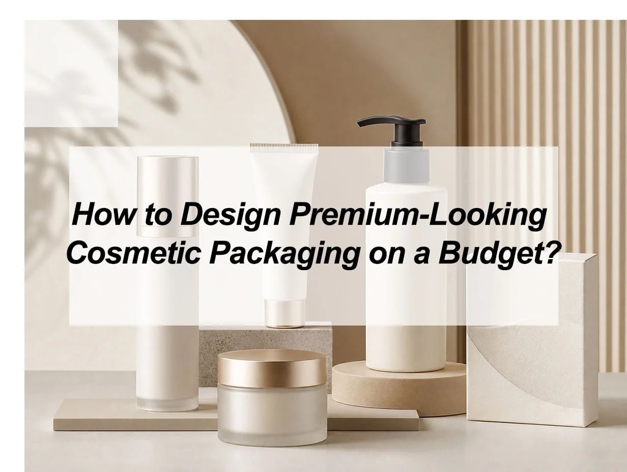
Cheap-looking packaging can weaken a good cosmetic product. I have seen strong formulas lose attention because the bottle, tube, or jar did not look trusted.
You can design premium-looking cosmetic packaging on a budget by using a simple structure, clean typography, limited colors, smart logo placement, and one or two high-impact finishes. You should spend money on product protection, printing accuracy, and consistent branding, then save money by using stock packaging, smaller sizes, fewer decorations, and scalable customization.
A premium look does not always come from expensive materials. It often comes from control. When every color, word, surface, and finish has a clear job, the packaging starts to feel more refined. This is especially important for cosmetic packaging, because buyers judge beauty products fast. They look at the color first. They touch the surface next. Then they decide if the product feels safe, modern, and worth the price.
What Makes Cosmetic Packaging Look Premium Without a High Cost?
Premium cosmetic packaging looks expensive when it feels intentional. It should have clear spacing, readable text, good color control, a clean logo, and a surface finish that supports the brand mood.
Many brands try to make packaging look premium by adding more things. They add more colors, more icons, more claims, more foil, more patterns, and more text. I usually think the opposite works better. A luxury look often starts when I remove the weak details. A simple lipstick tube with one strong logo can look better than a crowded custom tube. A cream jar with a matte cap and clean label can look more premium than a jar covered with too many design elements.
Start With Visual Silence
Premium design often gives the eye room to rest. White space, soft contrast, and balanced layout make a package feel calm. A crowded pack feels rushed. A calm pack feels more expensive.
| Design choice | Budget effect | Premium effect |
|---|---|---|
| Fewer colors | Lower printing cost | Cleaner brand image |
| Simple typography | Easier production | Better readability |
| One main logo position | Less artwork complexity | Stronger brand memory |
| Matte or soft-touch area | Moderate cost | Better hand feel |
| Small foil detail | Controlled cost | Luxury signal |
Use One Strong Design Signal
I prefer to choose one premium signal instead of many. For example, I may use a matte black cap, a rose-gold logo, or a clean label with large spacing. I do not need all three on every SKU.
A premium signal should be easy to notice. It should not fight with other design details. If the product is skincare, the signal can be soft color and clean science-style typography. If the product is makeup, the signal can be bold color and a glossy highlight. If the product is fragrance or gift packaging, the signal can be texture, foil, or an elegant outer box.
Keep the Structure Clean
The structure must look neat before decoration starts. A weak cap, loose pump, thin wall, or poor label alignment will make even expensive artwork look cheap. I always treat structure as the base. The decoration can only improve the base. It cannot fully hide a bad structure.
How Can I Choose Budget-Friendly Materials That Still Feel High-End?
I can choose budget-friendly materials that still feel high-end by matching the material to the product, using stock molds when possible, and upgrading touchpoints like caps, labels, coatings, or outer cartons.
Cosmetic packaging does not need to be fully custom to look premium. Stock cosmetic packaging can look strong when the shape is clean and the decoration is consistent. For many brands, a stock bottle or jar with a good label, a refined color, and a suitable cap is enough for the first product launch. This lowers mold cost and reduces risk.
Match Material to Brand Positioning
Different cosmetic products need different signals. A serum often needs a more clinical and precise feeling. A cream jar can feel soft, stable, and rich. A lip gloss tube needs clarity, shine, and clean applicator details. A lotion bottle needs good pump function and a neat silhouette.
| Product type | Budget-friendly base | Premium upgrade |
|---|---|---|
| Lip gloss tube | Stock clear tube | Custom cap color or logo print |
| Lotion bottle | PET or PP bottle | Matte label or pump color match |
| Cream jar | Standard plastic jar | Thick-looking wall or metallic lid |
| Serum bottle | Stock dropper bottle | Frosted finish or simple label |
| Cushion compact | Standard compact case | Clean top logo and soft color |
Spend on the Parts Buyers Touch
I do not always spend money on every surface. I spend money where buyers notice most. The cap, pump, applicator, lid, outer label, and first visible panel matter a lot. A strong cap can make a simple bottle feel better. A clean pump can make a lotion bottle feel more reliable. A good label texture can make a plastic bottle feel more finished.
Avoid Fake Luxury
A package can look cheap when it tries too hard. Too much gold, too many gradients, and too much shiny decoration can feel noisy. Real premium packaging often feels confident. It does not need to shout. It uses fewer details, but each detail is controlled.
I also avoid choosing a heavy custom structure too early. A custom mold can be useful when the brand has stable volume and a clear design system. But for small or growing cosmetic brands, stock packaging plus smart decoration is often a better first step.
Which Printing and Finishing Methods Create the Best Premium Effect on a Budget?
The best budget-friendly premium finishes are screen printing, matte coating, spot gloss, foil stamping, embossing, debossing, and high-quality labels. The key is to use them with restraint.
A finish should guide the customer’s attention. It should not cover the whole package without reason. I often prefer one small foil logo instead of full metallic decoration. I prefer a matte surface with one glossy detail instead of a full shiny package. This contrast creates depth, but the cost stays easier to control.
Choose the Right Finish for the Message
| Finish | Best use | Cost control tip |
|---|---|---|
| Screen printing | Logo and simple text | Use fewer colors |
| Matte coating | Soft skincare look | Apply to main surface only |
| Spot UV | Highlight logo or pattern | Keep area small |
| Foil stamping | Premium logo cue | Use one metallic tone |
| Embossing | Tactile brand mark | Use on outer box or label |
| Label printing | Flexible small batches | Standardize size across SKUs |
Use Labels as a Smart Custom Tool
Labels can be very useful for small and medium cosmetic brands. They allow product lines to change without changing the bottle or jar. A skincare line may use the same bottle shape, same cap, and same label size, then change the color band for each formula. This keeps the brand consistent and reduces development cost.
A good label should not look like an afterthought. It needs correct size, clean corners, proper material, strong adhesive, and accurate placement. If the label wrinkles, lifts, or looks misaligned, the full pack looks cheaper.
Control Color Before Adding Effects
Color is one of the cheapest ways to improve perceived value. A soft cream tone, deep green, warm beige, black, white, or muted pink can create a premium mood. The color should match the product claim. For example, a calming skincare product can use low-saturation colors. A bold makeup product can use stronger contrast.
I like to build a small color system. One main color, one neutral color, and one accent color are usually enough. This keeps printing easier and makes the product line look more professional.
How Should I Decide Where to Spend and Where to Save?
I should spend money on protection, function, color accuracy, print quality, and the first touchpoint. I should save money by reducing size, simplifying structure, limiting colors, using stock packaging, and avoiding too many finishes.
A budget is not only a limit. It is also a filter. It forces me to decide what matters most. Cosmetic packaging must protect the formula first. It must not leak, crack, fade, or feel unstable. A beautiful package that fails during shipping is not premium. It is expensive damage.
Spend Here First
I put money into the areas that protect quality and trust.
| Priority | Why it matters |
|---|---|
| Product compatibility | The formula must work with the packaging material |
| Closure and sealing | Leaks damage trust fast |
| Printing accuracy | Poor color matching looks unprofessional |
| Label material | Bad labels make the pack look cheap |
| Batch consistency | Buyers expect the same look every time |
Save Here Without Hurting the Look
I save money by simplifying what the customer does not value as much.
| Save area | Better choice |
|---|---|
| Full custom mold | Use stock mold first |
| Oversized box | Use tighter dimensions |
| Many colors | Use one or two strong colors |
| Too many claims | Keep one clear message |
| Heavy decoration | Use one focused finish |
Think About Shipping and Assembly
Packaging cost does not stop at the unit price. A large box can increase shipping cost. A complex carton can increase assembly time. A fragile component can increase breakage. A rushed order can increase air freight cost. So I look at the full cost, not only the quoted price.
A smaller box can feel premium when the fit is good. A clean insert can protect the product and improve unboxing. A simple sticker seal can make the pack feel finished. These small choices can work better than expensive decoration.
How to Design Premium-Looking Cosmetic Packaging on a Budget?
I design premium-looking cosmetic packaging on a budget by building a simple design system first, then using stock structures, controlled colors, clear typography, and one refined finish to create a high-end impression.
This is the question I always come back to. The answer is not only “make it cheaper.” The real answer is “make every design decision work harder.” Premium packaging is not about spending everywhere. It is about choosing where the buyer feels value.
Step 1: Define the Product Feeling
Before I choose a bottle or color, I define the feeling. Does the product need to feel clean, clinical, natural, bold, youthful, elegant, or luxury? This decision controls the full design.
| Brand feeling | Packaging direction |
|---|---|
| Clean | White space, simple label, clear bottle |
| Natural | Warm neutrals, paper texture, soft shapes |
| Clinical | Sharp typography, blue/white tones, precise layout |
| Luxury | Dark tones, foil logo, matte or glossy contrast |
| Youthful | Bright accent color, simple icon, playful detail |
Step 2: Choose a Stock Base With a Good Shape
A good stock base can save a lot of money. I look for a shape that already feels balanced. The cap should match the bottle. The shoulders should look smooth. The wall should not feel too thin. The pump should feel stable. When the base shape is good, I do not need to cover it with heavy decoration.
Step 3: Build a Repeatable Design System
A product line looks more premium when it looks organized. I use the same logo position, same label size, same font family, and same layout across the range. Then I change one controlled element, such as color or product name.
This method helps buyers recognize the brand faster. It also helps production because the artwork is easier to manage.
Step 4: Add One Premium Touch
One premium touch can be enough. It can be a small foil logo, a matte cap, a spot gloss pattern, a soft-touch label, or a clean outer box. I do not add all of them at once. If I add too much, the cost rises and the design loses focus.
Step 5: Test the Real Sample
A digital mockup can look beautiful. A real sample tells the truth. I check color under normal light, label alignment, pump function, cap tightness, hand feel, and shelf look. I also check if the product still feels premium after shipping. This step helps avoid expensive mistakes before bulk production.
How Can a Small Cosmetic Brand Build a Premium Packaging System Over Time?
A small cosmetic brand can build a premium packaging system over time by starting with a simple core pack, testing customer response, then upgrading materials, finishes, and custom parts only after volume becomes stable.
I do not think every brand should start with the most expensive packaging. A smart brand can grow in stages. The first stage should prove the product and the visual direction. The second stage can improve decoration. The third stage can add custom structure when the sales volume supports it.
Build in Three Stages
| Stage | Packaging goal | Best budget move |
|---|---|---|
| Launch | Look clean and trusted | Stock packaging + strong label |
| Growth | Improve shelf appeal | Better finish + consistent color system |
| Scale | Build brand ownership | Custom mold or signature structure |
Keep the Brand Assets Stable
The logo, main color, typography, and layout should stay consistent. If these change too often, the brand looks uncertain. Customers may not recognize the product line. Suppliers may also make more mistakes because artwork changes too much.
A stable system makes the brand look bigger than it is. Even with standard bottles, a consistent line can feel organized and premium. This is important for cosmetic packaging because many buyers compare several products at the same time.
Upgrade What Customers Notice First
When the budget grows, I upgrade the first visible and first touched elements. I may improve the cap, add a better label stock, use a cleaner pump, or improve the outer carton. I do not rush into a custom mold unless the shape is central to the brand identity.
Premium packaging is a long-term system. It should protect the product, support the brand, and stay realistic for production. When I design with this mindset, the package can look high-end without losing control of cost.
My insights: How to Design Premium-Looking Cosmetic Packaging on a Budget
A limited budget can make packaging design feel stressful. If every choice looks too simple, the product may look cheap before customers even try it.
I can design premium-looking cosmetic packaging on a budget by keeping the structure simple, using clean colors, choosing readable typography, and adding one strong premium detail. I should spend on function, surface quality, printing accuracy, and brand consistency, then save by using stock packaging, fewer colors, standard sizes, and simple decoration.
The key is not to make the packaging look expensive in every detail. The key is to make it look controlled. A premium package usually has fewer random choices. The bottle shape, cap color, label size, logo position, and finish all work together. When these parts feel consistent, even a budget-friendly cosmetic package can look polished.
Start With a Clean Base
I would first choose a packaging shape that already looks balanced. A stock lipstick tube, cream jar, lotion bottle, or airless bottle can still look premium if the proportion is clean. I do not need a custom mold at the beginning. A poor custom design can look worse than a good standard structure.
| Design area | Budget-friendly choice | Premium effect |
|---|---|---|
| Packaging shape | Stock mold with clean lines | Looks stable and professional |
| Color system | One main color and one accent color | Feels organized |
| Logo | Simple logo placement | Builds brand memory |
| Finish | One matte, glossy, or foil detail | Adds value without waste |
| Label | Clean layout with enough spacing | Improves readability |
Use Fewer Elements, But Make Them Better
I would avoid using too many colors, patterns, claims, and finishes at the same time. These details increase cost and can make the package look busy. Instead, I would use one clear design direction. For example, a skincare product can use soft neutral colors, simple text, and a matte label. A makeup product can use stronger contrast, a glossy cap, or a small metallic logo.
Spend Money Where Customers Notice First
Customers notice the cap, pump, label, logo, and surface finish before they study the full product. These are the best places to upgrade. A simple bottle with a smooth pump and accurate printing can look more premium than a complex package with poor alignment.
I would also check the real sample before production. The color on screen may not match the real surface. The label may look different under light. The cap may feel loose. These small problems can make packaging look low-end. A sample helps me fix them early and keep the final product looking clean, reliable, and premium.
Conclusion
Premium cosmetic packaging on a budget comes from clear choices, not heavy spending. Keep the structure clean, control the visuals, and upgrade only where buyers feel value.