Choosing sunscreen packaging without a clear comparison system creates waste, delay, and weak shelf impact. A visual explorer makes each decision easier to test.
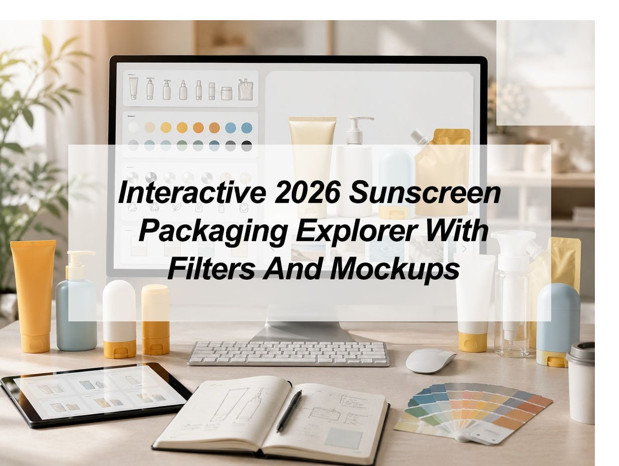
An interactive 2026 sunscreen packaging explorer helps brands choose better SPF packaging by combining filters, material options, product formats, and realistic mockups in one decision tool. It helps teams compare tubes, bottles, pumps, sticks, refillable packs, label space, recyclability, and visual style before sampling or production begins.
I see sunscreen packaging as one of the most demanding areas in cosmetic packaging. It is not only a container. It must protect an active formula, support daily use, show SPF information clearly, and still look attractive on a shelf or product page. In 2026, packaging also needs to answer more questions about sustainability, refillability, recycling, smart labels, and online presentation. This is why a simple catalog is no longer enough. A brand needs a tool that can compare practical packaging choices in a clear and visual way.
What Filters Should a Sunscreen Packaging Explorer Include in 2026?
A sunscreen packaging project can look simple at first. Then formula, material, closure, label, and mockup choices quickly become hard to control.
A 2026 sunscreen packaging explorer should include filters for formula type, packaging format, capacity, material, closure, dispensing style, decoration method, recyclability, refillability, label space, and mockup scene. These filters help brands move from a broad idea to a practical packaging shortlist before they start sampling.
The first filter should be the sunscreen formula type. A cream, lotion, gel, spray, stick, mineral sunscreen, chemical sunscreen, and tinted sunscreen do not need the same pack. A thick mineral sunscreen may need a wider dispensing path or a tube that squeezes smoothly. A light facial SPF lotion may work better in an airless pump bottle because controlled dosing feels cleaner and more premium. A sport sunscreen may need a stick, spray, or durable bottle that can sit in a gym bag without leaking. A kids sunscreen may need strong grip, soft colors, and easy one-hand use.
Core Explorer Filters
| Filter | Why It Matters | Example Options |
|---|---|---|
| Formula type | The formula decides dispensing and protection needs | Mineral, chemical, tinted, gel, cream |
| Format | The format shapes user habit and brand position | Tube, bottle, pump, stick, spray |
| Capacity | Size affects channel, price, and portability | 30 ml, 50 ml, 100 ml, 150 ml |
| Material | Material affects cost, touch, recycling, and protection | PE, PP, PET, PCR, aluminum |
| Closure | Closure affects leakage, use, and perceived quality | Flip cap, screw cap, pump, twist-up |
| Decoration | Decoration affects brand look and label clarity | Silk screen, label, hot stamping, matte finish |
| Mockup scene | Mockups show how the pack performs visually | White background, shelf, beach, handbag |
The explorer should also include use-case filters. A buyer may not know the right format at the start. But they usually know the use case. They may need daily facial SPF, beach body sunscreen, kids sunscreen, mineral SPF, makeup-friendly SPF, or travel sunscreen. The explorer can turn this use case into better format suggestions. For example, facial SPF may show slim tubes and airless pump bottles first. Body SPF may show larger tubes and lotion bottles first. Touch-up SPF may show sticks or small portable packs first.
I would also add a risk filter. This filter can show whether a pack has higher risk in leakage, recycling, label space, MOQ, decoration complexity, or formula compatibility. This is important because many early packaging choices fail for practical reasons, not because the design is ugly. A glossy tube may look good in a mockup, but the back label may not have enough room. A pump bottle may feel premium, but the pump may not match the formula viscosity. A refillable pack may sound sustainable, but the refill habit may not fit the product price or user behavior.
Which Sunscreen Packaging Mockups Help Brands Compare SPF Packaging Formats?
A flat label design can look beautiful on screen and still fail on the final package. Mockups show the problem before money is spent.
The most useful sunscreen packaging mockups are front-view product mockups, angled 3D mockups, e-commerce thumbnail mockups, shelf lineup mockups, handheld size mockups, and lifestyle scene mockups. These views help brands compare readability, size, color, cap proportion, label space, and visual appeal before physical sampling.
Mockups matter because sunscreen packaging must work in many places at the same time. It must look clear on a white product page. It must stand out in a retail lineup. It must feel trustworthy in a skincare routine. It must also communicate SPF value, broad-spectrum protection, water resistance, and usage purpose quickly. A customer may only see the product as a small mobile image. If the SPF number, product name, or key benefit is not readable, the design is already weak.
Best Mockup Types for Sunscreen Packaging
| Mockup Type | What It Tests | Why It Helps |
|---|---|---|
| Front-view mockup | Label clarity and SPF readability | Checks the first impression |
| 3D angled mockup | Shape, cap, and proportion | Shows the real package feeling |
| E-commerce mockup | Small-image readability | Helps online sales pages |
| Shelf mockup | SKU family consistency | Supports retail planning |
| Handheld mockup | Real size and portability | Shows user experience |
| Lifestyle mockup | Product use moment | Connects pack with buyer lifestyle |
A sunscreen tube mockup and a sunscreen bottle mockup can tell very different stories. A tube often feels casual, flexible, and travel-ready. An airless pump bottle feels more like premium skincare. A sunscreen stick feels clean, active, and easy for touch-ups. A spray bottle feels fast and suitable for outdoor body use. A refillable bottle can feel responsible and modern, but only if the system looks simple enough for repeat use.
I would use mockups to compare the same design across different formats. For example, the explorer can show one SPF 50 brand concept on a tube, pump bottle, stick, and refillable bottle. Then the team can see which format carries the brand story best. The color may look fresh on a tube but too plain on a bottle. The logo may fit a wide front panel but look crowded on a stick. A cap color may look modern in a render but too playful for a dermatology-style product.
Mockups also support faster internal approval. Marketing can judge visual appeal. Product development can check space and usability. Purchasing can compare complexity. Sales can imagine how the product looks in a catalog or online store. This does not replace real samples. It cannot test leakage, touch, printing quality, or long-term formula compatibility. But it can reduce weak sample requests. It helps a team reject poor ideas earlier and send clearer packaging briefs to suppliers.
How Should Brands Compare Recyclable and Refillable Sunscreen Packaging?
Sustainable packaging sounds simple in a meeting. In real development, it becomes a series of material, structure, and user-behavior decisions.
Brands should compare recyclable and refillable sunscreen packaging by checking material type, component count, mono-material potential, PCR content, decoration method, pump structure, refill convenience, local recycling acceptance, and product compatibility. A packaging explorer should show these trade-offs clearly instead of using one simple “eco-friendly” label.
A sunscreen package can be recyclable in one place and rejected in another. A hard plastic bottle may be accepted by some recycling systems, while a soft squeeze tube may be more difficult. A pump may add value for use, but it can also add mixed materials. A refillable bottle may reduce repeat packaging, but only when the refill system is easy, affordable, and attractive enough for the customer to use again. This is why a good explorer should not use vague green claims. It should show the real packaging structure.
Sustainability Comparison Table
| Sustainability Factor | Question to Ask | Explorer Output |
|---|---|---|
| Main material | What is the largest material in the pack? | PE, PP, PET, PCR, aluminum |
| Component count | How many parts need separation? | Low, medium, high complexity |
| Mono-material design | Are the main parts from one material family? | Yes, partial, no |
| PCR content | Can recycled plastic be used? | Available percentage range |
| Refill system | Can the consumer refill easily? | Cartridge, pouch, bottle refill |
| Decoration method | Does printing or labeling affect recycling? | Direct print, label, sleeve |
| Local recycling | Is the pack accepted in target markets? | Market-specific note |
The explorer should also compare sustainability with usability. A pack that is easier to recycle is not always better if it leaks, breaks, or makes sunscreen hard to apply. A mono-material pack can be useful, but it still needs to protect the formula. An aluminum option can create a strong barrier and premium look, but it can dent and may cost more. A refill system can support a circular story, but it needs a real use plan. If the refill is messy, expensive, or hard to buy, the customer may not repeat.
I would add a “trade-off view” to the explorer. This view can compare three packaging options side by side. Option A may be a low-cost PE tube with strong portability. Option B may be an airless pump bottle with better dosing and a skincare look. Option C may be a refillable bottle with a stronger sustainability story. The team can compare cost level, recyclability, label space, formula protection, user habit, and mockup appeal in one table.
Smart packaging can also support sustainability. A QR code can guide users on how to recycle the pack, how to separate the cap or pump, how to refill, and how to store sunscreen away from heat and direct sun. It can also link to formula details, usage instructions, product authentication, or local recycling guidance. This is useful because sunscreen packaging often has limited label space but must still carry important information.
How Can Mockups Reduce Sunscreen Packaging Mistakes Before Production?
Many packaging mistakes are visible before sampling. The problem is that teams often do not check them in a structured way.
Mockups reduce sunscreen packaging mistakes by showing label crowding, weak SPF visibility, poor color contrast, awkward cap proportions, small thumbnail problems, and inconsistent SKU design before production. Interactive mockups also help teams compare options faster and avoid unnecessary samples, delays, and redesign costs.
The most common mistake is treating the package as a flat rectangle. A label may look balanced in a design file, but the real package may be curved, narrow, soft, glossy, or textured. The SPF number may sit too close to the edge. The product name may bend around the tube. The back label may become too crowded. A water-resistance claim may not have enough space. The ingredient or usage area may be too small. A mockup can make these issues visible before printing.
Pre-Production Mockup Checklist
| Checkpoint | What to Review | Why It Matters |
|---|---|---|
| SPF visibility | Can the SPF number be seen fast? | Supports quick product understanding |
| Broad-spectrum text | Is the protection claim clear? | Helps label communication |
| Front label hierarchy | Does the eye read the right things first? | Improves shelf and online impact |
| Back label space | Is there enough room for directions? | Reduces redesign risk |
| Cap proportion | Does the closure match the body shape? | Improves perceived quality |
| Thumbnail view | Is the design readable on mobile? | Supports e-commerce sales |
| Color family | Are different SKUs easy to separate? | Helps product range navigation |
Mockups also help test the product family. Many sunscreen lines have SPF 30, SPF 50, mineral sunscreen, kids sunscreen, sport sunscreen, tinted sunscreen, and after-sun products. If every SKU looks too similar, customers may feel confused. If every SKU looks too different, the brand loses unity. A mockup explorer can show the full lineup in one view. Then the team can adjust color blocks, icon systems, cap colors, or typography before samples are made.
Another important point is label compliance space. Sunscreen products often need clear SPF and broad-spectrum information, usage directions, warning text, and water-resistance statements. The explorer should remind the team not to use every front-panel area for branding only. A beautiful design can still fail if it cannot hold the required information in a readable way. The same issue appears in global markets because label expectations can differ between the U.S., EU, Middle East, Southeast Asia, and South America.
A smart mockup system can include “safe zones.” These zones show where important information should sit and where the design may curve, fold, or become hard to read. This helps non-design teams understand the package better. Buyers, founders, and sales teams can make better comments when they see the design on the real shape instead of a flat layout.
How Can an Interactive Explorer Reduce Sunscreen Packaging Sourcing Risk?
Sourcing risk usually starts with an unclear brief. A filter-based explorer turns loose ideas into clear, supplier-ready packaging decisions.
An interactive sunscreen packaging explorer reduces sourcing risk by helping brands define format, capacity, material, closure, decoration, mockup style, sustainability target, and label space before contacting suppliers. This makes communication faster and reduces wrong samples, unclear quotations, delayed timelines, and mismatched expectations.
A weak packaging brief may say, “We need a premium sunscreen tube.” This is not enough. Premium could mean a matte finish, aluminum tube, airless pump, slim body, soft-touch coating, metallic cap, or clean medical-style label. Each choice changes cost, MOQ, tooling, lead time, and production risk. A supplier cannot respond well if the brief is too open. An explorer helps the buyer choose specific options before asking for samples.
From Weak Brief to Strong Brief
| Brief Area | Weak Input | Strong Input |
|---|---|---|
| Format | Sunscreen bottle | 50 ml airless pump bottle for daily facial SPF |
| Material | Eco plastic | PCR PET or mono-material PP option |
| Closure | Nice pump | White pump with clear overcap |
| Decoration | Custom logo | Two-color silk screen with matte finish |
| Mockup | Need design | Front, 3D, shelf, and e-commerce mockups |
| Use case | Daily sunscreen | Lightweight SPF under makeup |
| Label space | Normal label | Front SPF claim plus back usage and warning area |
This kind of structure helps every side. The buyer can compare fewer but better choices. The supplier can check mold availability, material options, decoration limits, and sample feasibility. The design team can build mockups around real packaging sizes. The compliance team can review label space earlier. The sales team can prepare a more realistic product story.
I would also include a comparison board inside the explorer. This board should let the user save three to five packaging options and compare them by capacity, material, closure, cost level, sustainability score, production complexity, label space, and mockup appeal. This is useful because packaging choices are rarely made by one person. Marketing may prefer the most beautiful option. Purchasing may prefer the most stable cost. Product development may prefer the safest formula match. Sales may prefer the option that looks strongest in online images. The comparison board makes these trade-offs visible.
The explorer should not promise that one option is perfect. Good packaging is a match. The right SPF package depends on formula, channel, market, user habit, budget, and brand position. But a good explorer can remove confusion. It can help a team move from “we like this look” to “this format fits our formula, our label, our cost target, and our launch plan.”
My insights: How Can an Interactive 2026 Sunscreen Packaging Explorer With Filters and Mockups Help Brands Choose Better SPF Packaging
Sunscreen packaging choices can become slow and unclear. A filter-based explorer helps teams see the right format before costly sampling begins.
An interactive 2026 sunscreen packaging explorer helps brands compare SPF formats, materials, closures, recyclable options, label space, and realistic mockups before production. It turns scattered packaging decisions into a clear visual workflow, so teams can match formula needs, market positioning, user habits, and sourcing requirements with better speed and confidence.
From Scattered SPF Packaging Choices to a Clear Visual Decision System
A sunscreen packaging explorer should not work like a simple product catalog. It should work like a practical decision tool. I would use it to compare sunscreen tubes, airless pump bottles, lotion bottles, sticks, sprays, refillable bottles, PCR options, mono-material structures, cap styles, decoration methods, and mockup scenes in one place.
| Decision Area | What the Explorer Should Compare | Why It Matters |
|---|---|---|
| Formula fit | Cream, lotion, gel, mineral SPF, tinted SPF | Different formulas need different dispensing systems |
| Packaging format | Tube, bottle, pump, stick, spray | Format affects use, cost, and brand image |
| Sustainability | PCR, mono-material, refillable, recyclable | Buyers need clearer eco-related choices |
| Visual mockup | Front view, 3D view, shelf view, e-commerce view | Teams can test design before production |
| Label space | SPF value, usage text, warnings, claims | Sunscreen packs need clear and readable information |
The strongest value of this explorer is that it connects technical packaging choices with visual mockups. A brand can see whether a package fits the formula, supports the label, looks strong online, and matches the final market position before ordering samples.
Conclusion
An interactive 2026 sunscreen packaging explorer helps brands compare filters and mockups earlier, so SPF packaging decisions become clearer, faster, and safer before production.